


Premade Covers by Genre: Using Clichés Wisely
A book cover's first job isn't to be wildly original; it's to be instantly readable. In a crowded online store, readers often decide in under a second whether a book is "for them," and genre signals on the cover do most of that work. For premade covers, this balance is everything: the design must be clear enough to fit its category at a glance, yet distinctive enough to stand out among dozens of similar titles. That's where the smart use of clichés—and the occasional break from them—becomes a powerful tool.
Clichés exist on book covers because they work. Over time, readers have learned to associate certain colors, fonts, and motifs with specific genres and emotional promises. A hooded figure in mist, a glowing portal, or a couple in an embrace immediately telegraph "horror," "fantasy," or "romance" before a single word of the blurb is read. These visual shortcuts help covers read clearly even as tiny thumbnails, and they make marketing easier because the book fits neatly into established category expectations. The downside is that when every cover in a genre leans too hard on the same tropes, individual titles start to blur together. That's why the most effective premade covers often combine familiar genre codes with one or two unexpected choices that give the design its own personality.
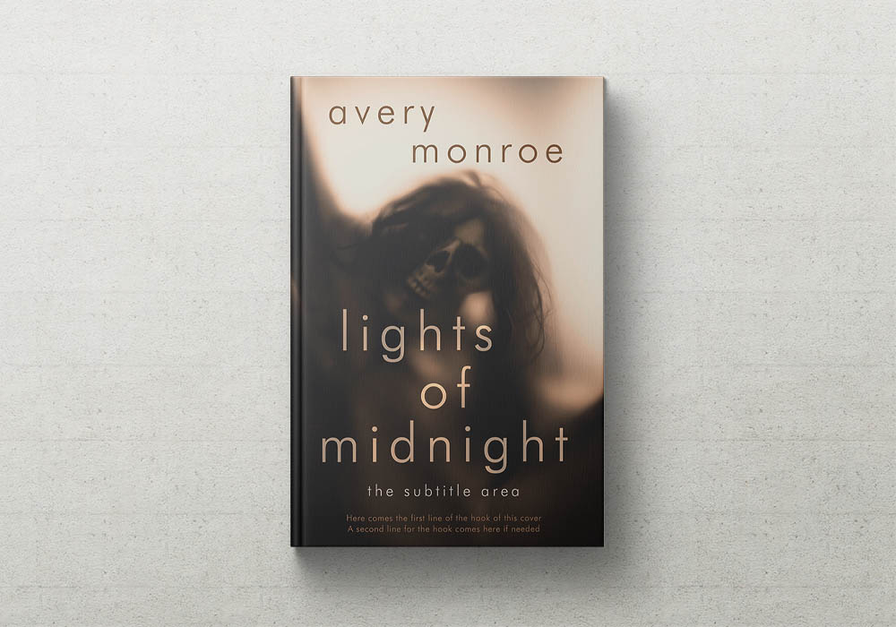
In horror, for example, readers expect darkness, threat, and a sense of unease. Classic horror covers lean on deep blacks and charcoals with a single sickly accent color, isolated locations like empty hallways or foggy forests, and distorted faces or watching eyes half-hidden in shadow. Typography tends toward distressed, scratched display fonts for slashers or restrained serifs for gothic and psychological horror. These elements work because they're immediately legible as horror, but they can fail when they feel cheap or overused—think generic blood splatters, random occult symbols, or busy scenes that don't read at small sizes. A more distinctive approach might focus on a single uncanny object (a broken doll, a warped mirror) or a domestic scene with one subtly wrong detail, letting the title itself feel unstable through tilted or fractured lettering while the image remains minimal. Combining a foggy forest path with an unexpected texture—trees that hint at human fingers or hair—and pairing it with elegant, clean serif type creates a cover that feels both recognizably horror and uniquely unsettling.
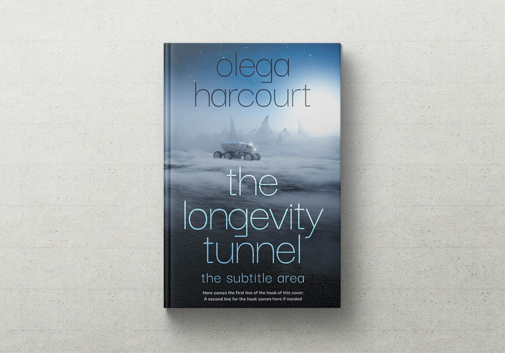
Science fiction covers, by contrast, signal futurism, technology, and scale. Readers look for space vistas, planets, spaceships, and sprawling cities rendered in cool blues, teals, purples, and metallic tones, often with neon accents. Sans-serif, geometric, or custom "techy" fonts reinforce this, along with visual details like grids, circuits, and HUD-like overlays. These conventions help a cover read as sci-fi at a glance, but they can fail when the composition feels like generic stock art or becomes too cluttered to read as a thumbnail. Elevating a sci-fi premade cover often means focusing on one striking concept—a strange artifact, an alien landscape detail, or a human figure in an unexpected context—rather than trying to show an entire epic scene. Bold typography can take center stage against a minimal background, and introducing organic or botanical elements into the futuristic setting (vines overtaking a skyscraper, bioluminescent forests on an alien world) can create an intriguing contrast. A minimalist city skyline in cool tones with large, warped neon title text and a single unusual detail like encroaching vegetation gives instant genre recognition with a fresh twist.
Fantasy covers carry expectations of world-building, magic, and ornate detail. Jewel tones—deep purples, emerald greens, navy—paired with gold or metallic accents are common, as are castles, dragons, warriors, and magical symbols. Ornate serif or blackletter-inspired display fonts, sometimes with flourishes or filigree, reinforce the sense of an imagined world. These elements work well to signal epic fantasy, but they can fail when scenes become overcrowded or when "warrior with sword" poses feel generic and dated. More distinctive fantasy premades often focus on a single magical object, a strange creature detail, or an abstract representation of power instead of a full battle scene. Typography can itself feel enchanted through hand-lettering, texture, or integration with magical motifs, and blending natural or botanical imagery with magical elements can suggest specific subgenres like folk or cozy fantasy. A deep jewel-toned background with subtle gold filigree and a central image of an unusual symbol—such as a key made of branches—paired with a custom, slightly irregular serif title creates a cover that reads clearly as fantasy while feeling less templated.
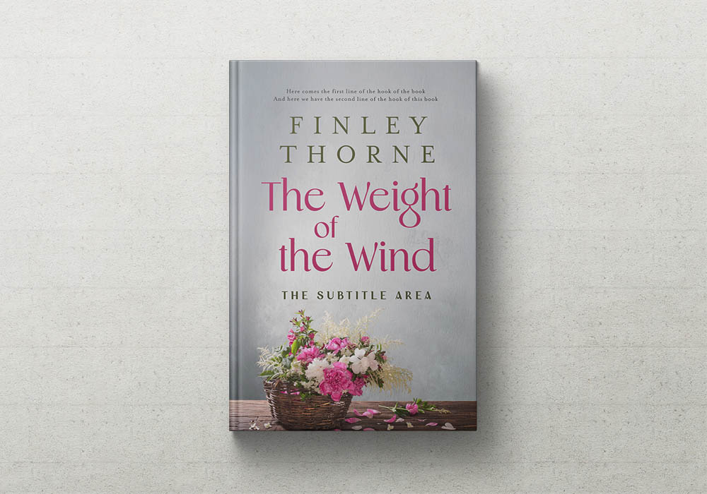
Romance covers, across contemporary, historical, and dark subgenres, promise emotional intimacy and warmth. Readers expect couples in emotionally charged poses (often faceless or partially obscured), warm or jewel-toned palettes, and elegant or playful typography depending on the subgenre. Script or high-contrast serif titles convey sweeping emotion, while cleaner sans-serifs suit lighter contemporary or rom-com vibes. Romantic symbols like rings, flowers, sunsets, and historical costumes reinforce the genre. These conventions help readers instantly recognize a romance, but they can fail when couple poses feel impersonal or outdated, or when overly decorative scripts reduce legibility at small sizes. More distinctive romance premades often focus on specific character details—tattoos, distinctive clothing, cultural markers—or use illustrated or stylized characters instead of photo-realistic couples to build a unique brand. Letting typography carry more weight with playful or custom lettering that reflects tone (whimsical for rom-com, sharp and bold for dark romance) can also elevate a cover. A couple in a close, romantic pose shown in stylized illustration with bold flat colors and a hand-lettered title that wraps around them, plus a specific detail like a tattoo or heritage cue, offers clear genre signaling with a fresh edge.
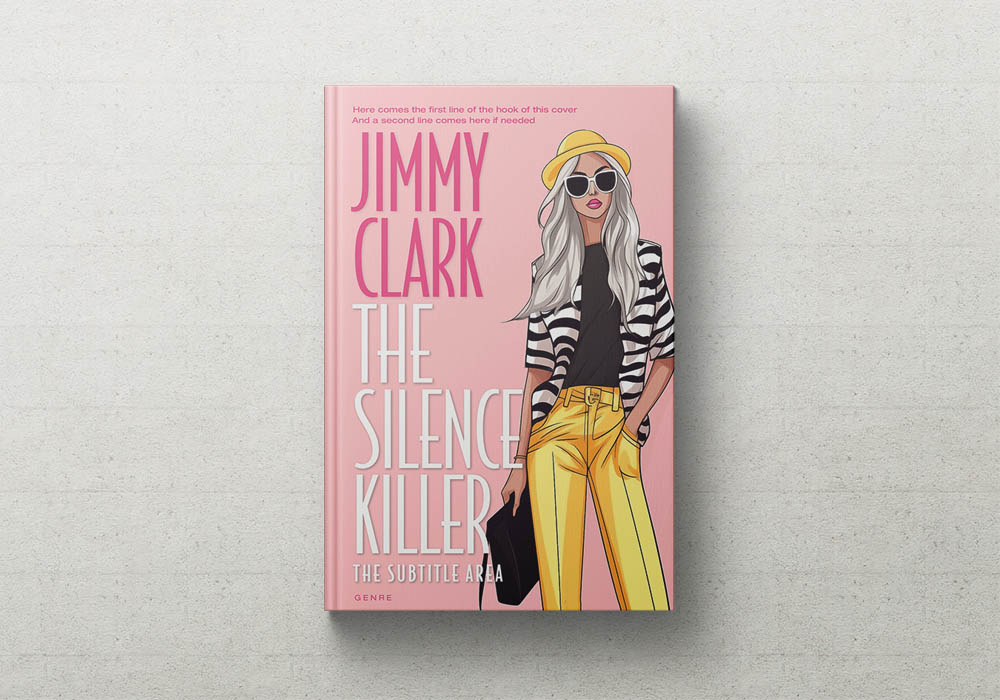
Chick lit and romantic comedy covers lean into light, fun, contemporary energy. Bright, cheerful palettes of pinks, corals, teals, and yellows are common, along with playful, hand-lettered or modern serif/sans-serif titles, sometimes mixed with script. Urban settings, cafes, fashion elements, friendship groups, or single heroines in dynamic poses reinforce the tone, often layered with florals, confetti, or patterned backgrounds. These elements work to signal a breezy, upbeat read, but they can fail when they feel overly "girly" or dated, or when too many competing elements make the cover look cluttered and less premium. More distinctive chick-lit premades often use bold typography as the hero with minimal illustration or a single strong character silhouette, adopt modern illustration styles with clean lines and limited palettes, or introduce a specific visual hook tied to the story—a quirky job, a city landmark, a signature accessory. A bright, playful palette and scripty title combined with a minimalist illustrated heroine in a distinctive outfit or setting, plus a title treatment that uses color blocking or unusual kerning, keeps the cover firmly in chick-lit territory while feeling contemporary and unique.
The most effective premade covers follow a simple principle: use one or two strong clichés to signal genre immediately, then add one novel element to give the design its own character. That might be an unusual object, a unique type treatment, or an unexpected color accent, but it should always support readability at thumbnail size. Typography should stay consistent with genre expectations while incorporating a small idiosyncrasy—slight distortion, custom ligatures, unusual spacing—to avoid a stock look. This approach gives authors the best of both worlds: their books are instantly categorized by readers, but the cover still feels distinctive enough to stand out in search results and on social media.
Cliché vs. Non-Cliché Elements by Genre
| Genre | Cliché Elements That Work | Non-Cliché Elements That Can Elevate |
|---|---|---|
| Horror | Dark backgrounds; isolated settings (houses, forests, hallways); distorted faces/silhouettes; red/black/green palettes; distressed or gothic type. | One uncanny object; domestic scenes with one wrong detail; typography-driven unease (tilted, fading titles); minimal compositions with strong negative space. |
| Science Fiction | Space vistas, planets, ships, futuristic cities; cool/neon palettes; geometric/techy sans-serif fonts; grids, circuits, HUD overlays. | Single striking concept/artifact; bold, warped or oversized typography as main visual; organic/botanical elements mixed with tech; simplified, concept-driven layouts. |
| Fantasy | Castles, dragons, warriors, magical symbols; jewel tones with gold accents; ornate serif/blackletter fonts; framed, layered illustrations. | Concept-driven single object/creature; typography as enchanted element; botanical/natural motifs blended with magic; less crowded, more signature-style designs. |
| Romance | Couples in embraces; warm/jewel palettes; script or high-contrast serif titles; romantic symbols (rings, flowers, sunsets). | Specific character details (tattoos, clothing, culture); illustrated/stylized characters; typography-forward designs reflecting subgenre tone; unique settings over generic poses. |
| Chick Lit / Rom-Com | Bright, cheerful palettes; playful/hand-lettered or mixed script titles; urban/fashion/friendship imagery; layered floral/patterned backgrounds. | Bold typographic heroes with minimal illustration; modern, clean illustration styles; specific story hooks (job, landmark, accessory); streamlined, less cluttered compositions. |