


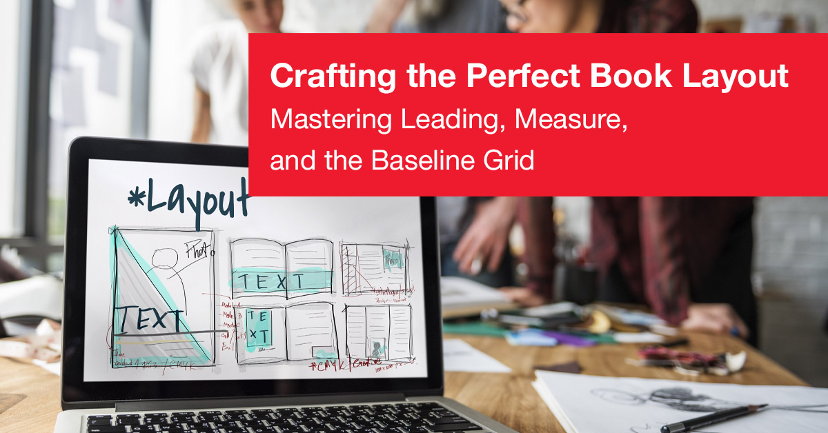
Crafting the Perfect Book Layout
The Invisible Symphony
How to Get the Right Layout For Your Books
I've seen people pick up a book and before they even start reading the first sentence their brain relaxes. The page feels “just right.” On the other hand, I've struggled through countless crampy budget books that felt like trying to read a spreadsheet in a blacked out room.
The difference has nothing to do with the paper itself; it's how the layout was designed. As a professional designer in the world of book design, if you did your job correctly, the reader will never know you were there. You're the un-noticed maestro of a silent symphony.
1. The Architecture of Silence (The Van de Graaf Canon)
Most beginner designers view margins as "what's left over." A professional views margins as the border of the artwork.
"One advanced secret of many professionals is the Van de Graaf canon, a geometric construction method developed by medieval scribes for determining the best placement of the text block within a given space."
To illustrate this point, let us assume that the height of the page is h and the width of the page is w. Often times the ideal ratio of the height to width is approximately 2/3. Typically, the gutter margin should be exactly one-half of the amount of the outside margin which creates a visually appealing pillar of white space when opened.
2. The Golden Rule of Vertical Rhythm
The readability of a piece of writing can either thrive or die depending upon leading (line spacing). Too little leading makes the eyes lose their way during its "return sweep."
The Optimal Amount Of Leading
120% to 145% of Font Size
The Best Practices of Professional Designers
Text alignment to a baseline grid to create matching vertical alignments of lines on opposing sides of a spread.
3. Typography: The "voice" of the Page
Choosing a font is not simply about aesthetics; it involves considerations such as optical sizing and x-height.
| Attribute | Why It Matters | What To Choose |
|---|---|---|
| Serifs | Directs the eye from one character to another. | Adobe Caslon |
| Measure | The horizontal distance across a single line of type. (fatigue reduction) | 45 – 75 Characters |
| Kerning | The amount of white space between two characters. | Optical |
4. Eradicating Pestilence
Fine detail in layout is akin to playing a game of "Whack-a-mole," except instead of mallets and moles, it is typographic errors and design tools.
The WidowA single word is located at the top of a newly formatted page. |
RiversWhite spaces (vertical gaps) between rows of justified text where lines don't break evenly. |
5. The Folkways of Reading
- Drop caps serve as "you are here" signs for each chapter title.
- Running heads: left side (verso) for Book Title, right side (recto) for chapter title.
- Folios: Do NOT place page numbers on blank or chapter opening pages.