


How to Create a Professional Novel Layout? by Catherina Blake Arslan
How a professional book layout is really made
A clean fiction layout feels effortless only because hundreds of small typographic decisions are working perfectly in the background—fonts, margins, spacing, rhythm, and the invisible rules that make readers trust the page.
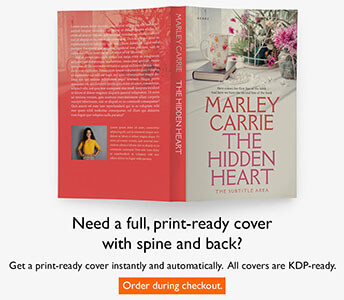
At BookCoverZone we’re mainly a book cover design agency, but lately we’ve been more and more drawn into book layouts, because many authors who purchase a cover naturally also need the inside of the book to feel just as considered, polished, and publishable as the outside.
There is also a personal reason this subject matters to me. As a book translator, I’ve spent years working hand in hand with book layout designers from all over the world. Our focus was always the book itself, but in the process they ended up teaching me a great deal—small, highly practical insider details that most readers never notice and most designers rarely explain in writing. Brilliant layout designers are often extraordinary at shaping pages, not at talking about how they do it.
And that is where the real craft begins. A professional fiction layout is not just text poured into a template. It is a reading system. Every decision on the page exists to support immersion, clarity, pacing, and trust.
Most readers will never stop and say, “What a beautifully typeset page.” But they will feel the difference instantly. Good layout creates calm. Bad layout creates friction, fatigue, and a subtle sense that the book is unfinished.
Why font choice is everything
Fonts are not decoration in fiction. They are reading technology, and the wrong choice can make even strong writing feel amateur.
In long-form reading, the best typeface is the one that quietly disappears after a few pages. That is why traditional book fonts keep winning. They were refined across generations of printing, paper stocks, and actual reader use, not just designed to look striking in a font menu.
Traditional serif fonts usually work best for the body text of novels because they create a more guided horizontal flow. The small finishing strokes on the letters help the eye travel across the line, make word shapes easier to recognize, and reduce strain over long reading sessions. On screen, a sans serif may feel cleaner at first glance. In print, over 250 or 350 pages, that same cleanliness can turn flat, mechanical, and tiring.
There is also a psychological layer to this. Readers are deeply conditioned to experience serif typography as “book language.” Serif fonts carry familiarity, authority, and narrative ease. A well-set Garamond, Caslon, Baskerville, Janson, or Minion immediately signals that the page belongs to the world of literature rather than office documents or web copy.
- Serif fonts support endurance: they are more comfortable across long uninterrupted reading sessions.
- Traditional faces produce better page color: the gray value of the text block looks more even and stable.
- They are shaped for paragraphs, not slogans: many trendy fonts look interesting in headings but fall apart in dense narrative text.
- Body typography is tuned, not guessed: point size, leading, tracking, and hyphenation all change how the same font performs.
Traditional winners
Garamond feels elegant and literary, Caslon warm and classical, Baskerville slightly more formal, and Minion remarkably balanced for modern publishing workflows.
What usually fails
Overused system fonts, fashionable display serifs, and geometric sans fonts often create weak texture, poor rhythm, or visible fatigue in long-form print reading.
Spacing is where layout lives or dies
Most weak interiors are not ruined by the font alone. They are ruined by spacing.
Good fiction layout is mostly a discipline of intervals. Line spacing, paragraph indents, chapter openings, scene breaks, and line length all work together to create page rhythm. Too tight, and the book looks defensive and cramped. Too loose, and it starts looking like a school handout pretending to be a novel.
Professionals usually aim for body text that breathes without floating. In practical terms, that often means leading around 120 to 145 percent of the font size, paragraph indents around 0.2 to 0.3 inches, no empty line between paragraphs in standard fiction, and a line length that stays readable rather than sprawling.
- Leading: enough vertical air to keep lines distinct, but not so much that paragraphs lose density.
- Indentation: consistent first-line indents, never manual tabs or improvised spaces.
- Line length: usually around 60 to 75 characters for comfortable narrative reading.
- Scene breaks: handled with discipline so the rhythm of silence feels intentional, not accidental.
Why Microsoft Word is not a real layout tool
Word is useful for writing and editing manuscripts. It is not where serious book typography reaches its final form.
This is one of the biggest misconceptions in self-publishing. Authors finish a manuscript in Word, so they assume the same software should also be able to produce a professional interior. Technically it can output pages. Typographically it remains limited.
Word is a word processor. It was built for drafting, collaboration, comments, and office-style document production. Professional book layout requires far more control than that: better hyphenation, better justification, stronger master-page logic, cleaner handling of long documents, proper typographic features, more stable styles, and far better control over page-by-page consistency.
| Tool | Best for | Main limitation or strength |
|---|---|---|
| Microsoft Word | Drafting, editing, collaboration | Weak microtypography, unstable long-document control, limited justification and page architecture |
| Adobe InDesign | Professional print interiors | Industry-standard control over styles, master pages, hyphenation, spacing, and typographic precision |
| Affinity Publisher | Affordable pro book layout | Excellent alternative for designers who want strong typographic control without Adobe subscription overhead |
| LaTeX | Highly structured, technical, academic work | Extremely precise, but less intuitive for fiction workflows and visually driven publishing teams |
In short, Word can produce a readable interior. What it rarely produces is a refined one. Once an author cares about ligatures, running heads, widow and orphan control, consistent vertical rhythm, or beautiful paragraph color, better tools become necessary.
Margins are calculated, not guessed
One of the clearest signs of amateur formatting is symmetrical margins that ignore how books are actually held and bound.
Books are not posters. They are handled objects. The inside margin has to compensate for the gutter and binding, while the lower margin often needs more space so the page feels visually anchored rather than top-heavy. Professional margins are about optical balance, not mathematical equality.
For a typical trade paperback novel, designers often work within familiar ranges rather than one universal formula. Inside margins may land around 0.75 to 0.9 inches, outside margins around 0.5 to 0.7, the top around 0.7 to 0.9, and the bottom often slightly larger. The exact numbers depend on trim size, binding method, page count, and font behavior.
- Inside margin: compensates for binding and prevents the text from sinking into the gutter.
- Outside margin: gives the thumb and the eye breathing room.
- Top margin: leaves space for running heads and keeps the text block from floating upward.
- Bottom margin: usually slightly deeper, because the page needs visual grounding.
The hidden layer: microtypography
This is the part readers rarely name, but they absolutely feel.
Microtypography is where a layout stops looking merely competent and starts feeling truly published. It covers the tiny refinements that improve texture, rhythm, and page polish: ligatures, kerning, hyphenation rules, optical margin alignment, consistent chapter spacing, widow and orphan control, and the evenness of the text block from spread to spread.
None of these details are spectacular on their own. That is exactly the point. Professional typography is often the art of making dozens of smart decisions that never call attention to themselves.
A short pro glossary
These are the terms that separate basic formatting from real publishing craft.
Running header / footer
Repeating information at the top or bottom of pages, often the author name, title, or folio number.
Glyph
A specific drawn form of a character inside a typeface, including alternates and special typographic characters.
Ligature
A combined character such as fi, fl, or ff, used to improve the visual flow of letter combinations.
Widow
A short final line of a paragraph stranded at the top of the next page or column.
Orphan
A first line or very short fragment left isolated at the bottom of a page, weakening visual continuity.
Gutter
The inner margin area where the book is bound and where text can become difficult to read if margins are too narrow.
Leading
The vertical distance between lines of text; pronounced “ledding,” not “leading” as in leadership.
Kerning
The adjustment of space between specific letter pairs so awkward gaps do not appear.
Tracking
The overall tightening or loosening of letter spacing across a range of text.
Baseline grid
An invisible alignment system used to keep lines of text sitting consistently across pages and elements.
Page color
The overall gray texture of a text block; professionals want it even, calm, and free of visual holes.
Optical margin alignment
A fine typesetting adjustment where punctuation hangs slightly outside the text block so edges look visually straighter.