


THANK YOU!
 YEARS IN SERVICE. WE HAVE PROUDLY SERVED 10.000+ AUTHORS & PUBLISHERS WORLDWIDE WITH BOOK COVERS CURATED BY INDUSTRY-LEADING DESIGNERS.
YEARS IN SERVICE. WE HAVE PROUDLY SERVED 10.000+ AUTHORS & PUBLISHERS WORLDWIDE WITH BOOK COVERS CURATED BY INDUSTRY-LEADING DESIGNERS.
← Back to Blog


Category: Design Matters
★ Featured
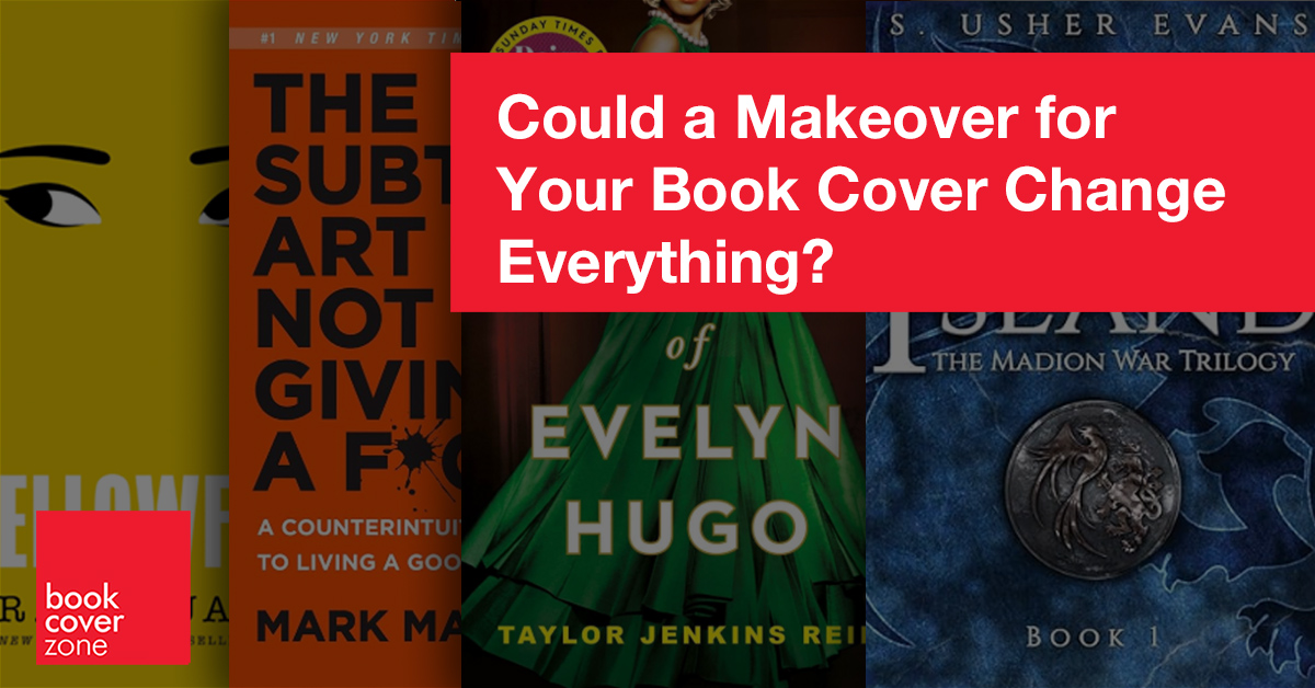
Could a Makeover for Your Book Cover Change Everything?
Yes! We live in an age of design. Victor Hugo might have gotten away with a plain brown wrapper for Les Misérables, but today’s readers expect mor...
Read More →
★ Featured
Choosing the Right Size For Your Book: A Short Guide to Book Cover Dimensions
When it comes to creating a book cover, one of the most crucial elements is getting the dimensions right. Whether you're publishing a novel, a memoir...
Read More →
★ Featured
Designing the Perfect Book Cover for Amazon KDP
In the realm of self-publishing, your book cover serves as the virtual storefront for your literary work. It’s the first impression potential reade...
Read More →
★ Featured
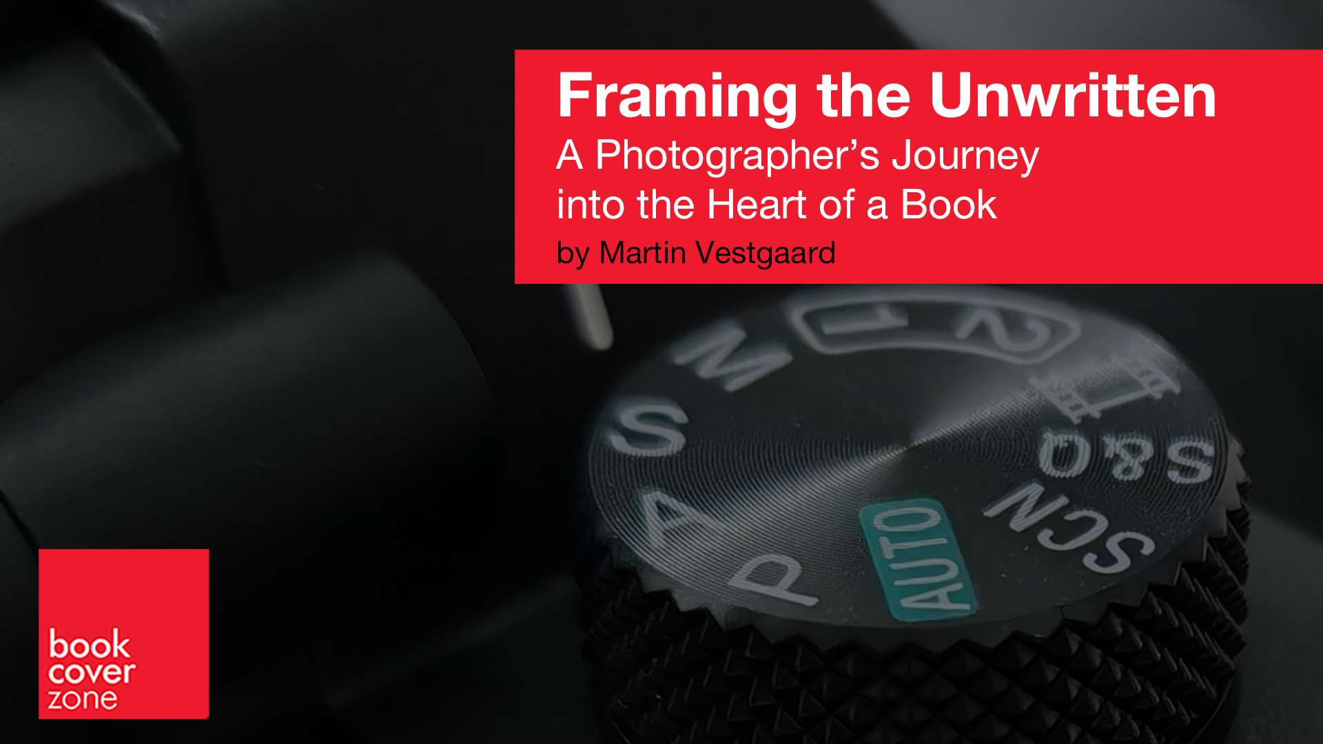
Framing the Unwritten: A Photographer’s Journey into the Heart of a Book
You might think that being a book cover photographer is just about taking great pictures. While that’s part of it, there’s an en...
Read More →
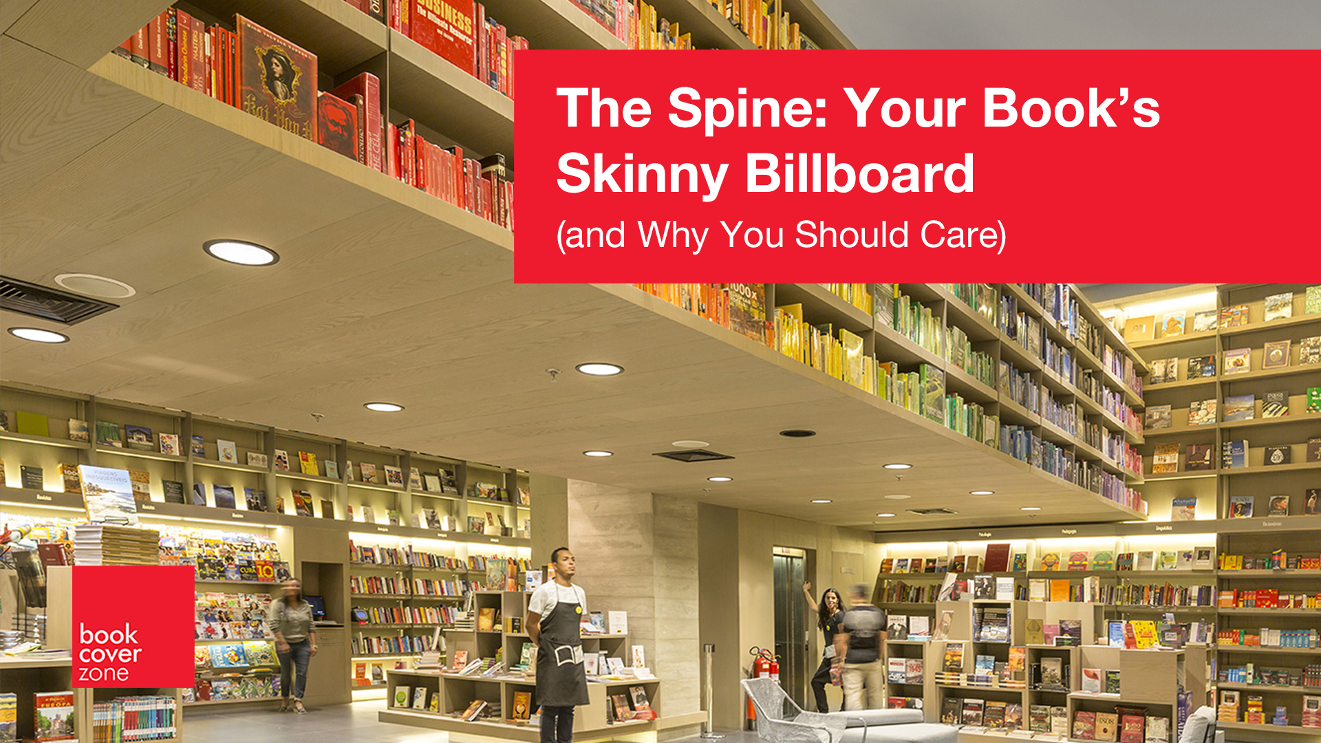
The Spine: Your Book’s Skinny Billboard (and Why You Should Care)
The First Thing Nobody Notices… Until They Do
Let’s be honest: nobody dreams of being a book spine designer. It's called "book cover designer"...
Read More →
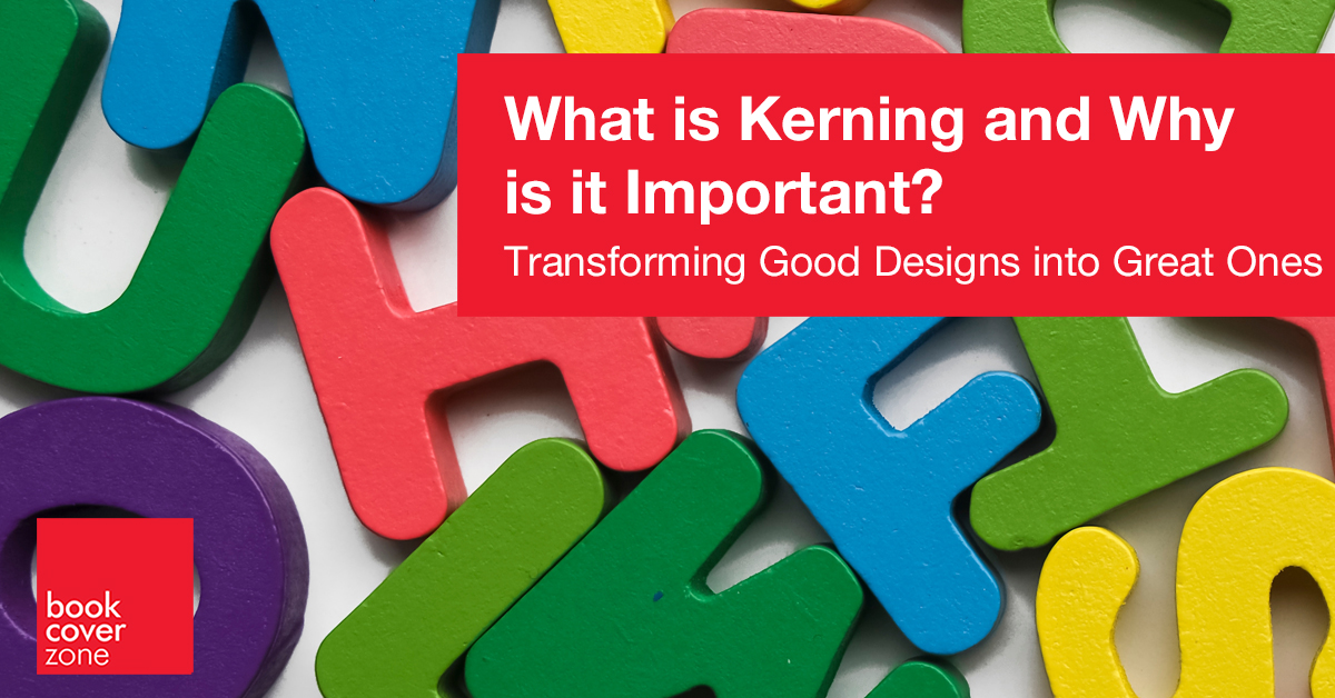
What is Kerning and Why is it Important?
When it comes to design, the devil is in the details. One detail that often goes unnoticed by the untrained eye, yet plays a pivotal role in professi...
Read More →
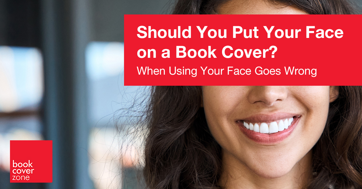
Should You Put Your Face on a Book Cover?
Imagine walking through a bookstore and catching the covers of hundreds or even thousands of books. What catches your eye first? Is it a famous autho...
Read More →
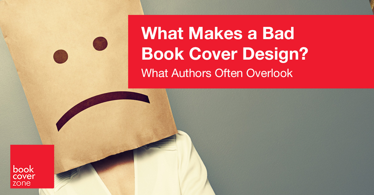
What Makes a Bad Book Cover Design?
The book market is flooded with badly designed books. Why is this? In an era where self-publishing has become increasingly accessible, many authors f...
Read More →
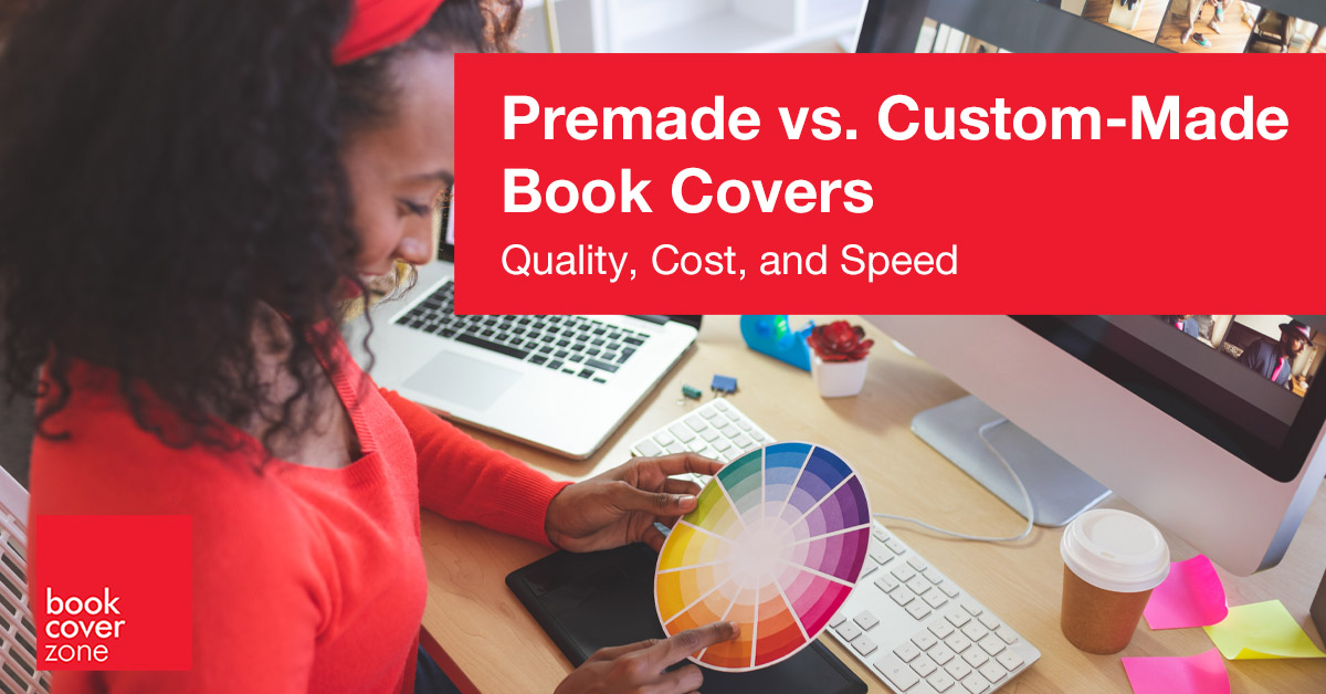
Premade vs. Custom-Made Book Covers
Throughout the history of book publishing, authors and publishers have relied on custom-made covers meticulously crafted to encapsulate the essence o...
Read More →
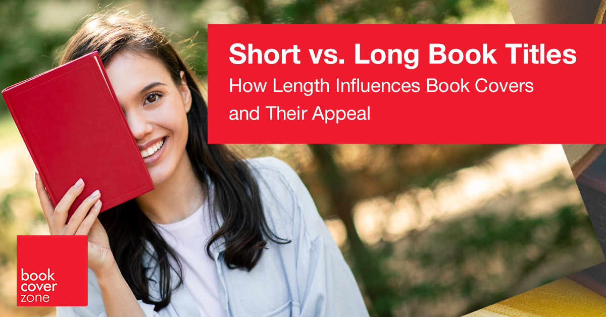
Short vs. Long Book Titles
The title of a book holds immense power. It’s the first impression, the headline that grabs a reader’s attention, and the promise of what’s ins...
Read More →