


In the world of publishing, the design of a book cover is a critical element in its market success, and two of the most essential components of that design are the author's name and the book's title and the way they are presented on the book cover. The relationship between these two elements, both typographically and hierarchically, helps determine how a potential reader perceives the book at first glance.
What's more important? The author or the book?
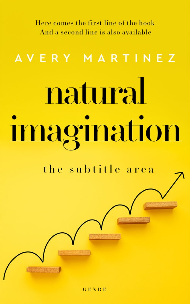
The hierarchy between the author's name and the book title on the cover can depend largely on the author's prominence and the marketing strategy behind the book. For a well-established author with a strong following, the author's name might be the most prominent element on the cover, sometimes even more prominent than the title itself. This strategy leverages the author’s established reputation as a selling point, reassuring readers of the quality and style they can expect from the book.
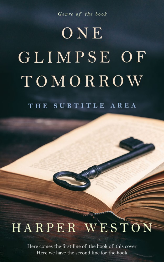
Conversely, for new authors, the book’s title will typically take precedence, displayed in larger and more striking typography. Here, the title's role is to intrigue and inform potential readers about the book's content, theme, or tone, serving as the primary draw since the author's name does not yet possess substantial recognition.
Finding a good proportion between the author’s name and the book's title involves a careful balancing act. A commonly effective strategy is to ensure that the title is immediately noticeable, occupying a significant amount of cover space without overwhelming. The author’s name, unless they are a well-known brand, should generally be smaller but still legible and positioned prominently enough that it doesn’t get lost. Again, for bestselling authors, the name can be as large as or even larger than the title, reflecting the author’s status and drawing in their existing audience.
| New Authors | Moderately Recognized Authors | Well-Established Authors |
|---|---|---|
| For authors who are relatively unknown and looking to establish a foothold in the literary market, the book title should prominently feature as the primary element of the design. In this scenario, the title can be sized up to 200%-250% larger than the author’s name. This proportion ensures that the title, which communicates the essence and genre of the book, grabs potential readers' attention first, helping new authors draw curiosity based on content. | Authors who have some recognition but are not yet household names might benefit from a more balanced approach. Here, the book title and the author's name can be closer in size, but with the title still slightly more prominent. A good proportion could be the title being about 100%-150% the size of the author's name. This size ratio allows the author's name to leverage existing recognition while still emphasizing the new book's title to attract readers. | For well-known authors whose names have significant drawing power, the author's name can take center stage. In such cases, the author's name might be designed to be equally large as the title or even up to 110%-150% the size of the title. This proportion capitalizes on the author's established reputation, where the name itself is a strong pull factor for the book’s audience, and it ensures that loyal readers can easily spot their favorite author's new work. |

It is also worth nothing that, sometimes, using the same font and font size for both the author's name and the book title on a cover can be effective in creating a strong, cohesive visual identity, particularly when aiming for a minimalist and modern look. This typographic uniformity ensures a clean and balanced design, which can enhance the overall readability and appeal of the cover. It also establishes a sense of equality between the author and the content, which can be particularly strategic when the author's name itself carries significant brand equity, similar to the importance of the title. This approach often works well for well-known authors whose name recognition can attract readers just as much as the book's content does, or in genres where stylistic simplicity is valued, such as literary fiction or academic works. In these contexts, uniform typography not only visually pleases but also subtly signals to the reader that the author's voice and the narrative are of equal importance.
When designing a cover, it's also important to consider the additional elements like subtitles, series information, or endorsers, which must be integrated harmoniously with the author's name and title. The overall layout should lead the eye naturally across the cover, providing a visual hierarchy that intuitively communicates the book's importance and genre.
Taglines, Subtitles, and Awards Placement
Taglines (also called hooks), which are short and engaging statements that capture the essence of the book, should be placed where they can immediately catch the reader's eye, yet do not compete with the main title. This is often effectively achieved by positioning them either at the top of the cover above the main title or at the very bottom. Subtitles, which provide further insight into the content, should be less prominent than the main title but still clearly readable. They usually work best when placed directly beneath the title, using a smaller or thinner font that compleplies harmoniously with the main title's typography.
Reward information, such as a notation indicating the book has won a literary award, must be included in a way that highlights the achievement without cluttering the cover. This can be addressed by incorporating a small, elegant badge or icon in a corner of the cover or near the author's name. Alternatively, a discreet banner across the top or bottom can serve this purpose without detracting from the impact of the main visual and textual elements. Careful consideration must be given to the balance and symmetry of these elements, ensuring that the cover doesn't become visually overwhelming. By thoughtfully arranging these elements, they can effectively contribute to the cover's appeal and help draw potential readers into the book's narrative world.
Serif and Sans-Serif Font Usage
Combining serif and sans-serif fonts can enhance the cover’s visual appeal by leveraging their contrasting characteristics. Serifs, with their decorative strokes, often convey tradition, reliability, and formality—ideal for historical or literary works. On the other hand, sans-serifs’ clean, modern lines can suggest innovation, simplicity, and forward-thinking—perfect for contemporary or sci-fi genres.
Using these font styles together can create a balanced and dynamic visual hierarchy. For example, a sans-serif font for the title paired with a serif font for the author's name can achieve a harmonious contrast that draws the reader’s eye and improves readability.
10 Serif and Sans-Serif Font Pairings for Book Covers
Choosing the right combination of serif and sans-serif fonts is crucial for achieving a harmonious and appealing book cover design. Here are ten pairs of established sans-serif and serif fonts that complement each other well and can effectively enhance the aesthetic of any book cover:
| Sans-serif | Serif | Notes |
|---|---|---|
| Helvetica | Garamond | Helvetica's neutrality and readability complement the elegant and old-style typography of Garamond. |
| Futura | Baskerville | Futura's geometric and efficient design contrasts nicely with Baskerville's sharp and refined serif details. |
| Franklin Gothic | Merriweather | The sturdy and strong character of Franklin Gothic balances the more traditional and readable Merriweather. |
| Gill Sans | Palatino | Gill Sans offers a humanist and friendly feel that meshes well with the Renaissance elegance of Palatino. |
| Avant Garde | Minion Pro | Avant Garde’s geometric and precise forms beautifully contrast with the classical proportions and fine details of Minion Pro. |
| Raleway | Charter | Raleway's elegant and clean lines pair well with Charter’s robust and practical design, ideal for readability. |
| Source Sans Pro | Goudy Old Style | Source Sans Pro's neutral and versatile appearance is a great backdrop for the old-style figures and classic feel of Goudy Old Style. |
| Century Gothic | Bodoni | The clean and geometric look of Century Gothic smoothly pairs with the sharp and high-contrast Bodoni, offering a visually striking mix. |
| Avenir | Didot | Avenir's modern and geometric design contrasts sharply yet harmoniously with Didot’s dramatic thin-to-thick stroke transitions and refined elegance. |
These combinations allow book cover designers to play with contrast and harmony, balancing traditional and modern aesthetics to suit various genres and themes. Each pair offers a distinct personality that can enhance the textual elements of a book cover, ensuring both readability and a visually compelling design.
Please note that, mixing sans-serif or serif fonts can be risky and should be approached with caution. Fonts within the same family type often share similar weights and structures, which can lead to a lack of visual distinction and hierarchy, making the cover appear cluttered or confusing. If done without careful consideration, it can disrupt the design’s cohesiveness and readability.