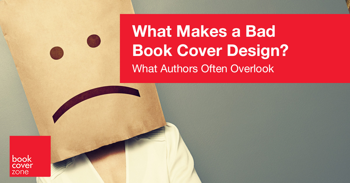
The book market is flooded with badly designed books. Why is this? In an era where self-publishing has become increasingly accessible, many authors find themselves navigating the complexities of book cover design without the guidance of professional expertise. As a result, the allure of creating their own covers or relying on friends and family with minimal design experience often leads to a myriad of pitfalls. These poorly executed designs can misrepresent the book’s contents, turning potential readers away and ultimately impacting sales. Understanding the mistakes commonly made in book cover design is essential for authors who wish to present their work in the best possible light.
One major aspect that often goes unnoticed by the untrained eye is the suitability of the design to the genre. A professional designer understands the nuances of visual language and knows how to tailor a cover to resonate with its target audience. For instance, the aesthetic for a romance novel differs dramatically from that of a science fiction or thriller book. Professionals are adept at utilizing elements like color schemes, typography, and imagery that align with the expectations of each genre, ensuring readers instantaneously recognize what type of story they might be diving into.
One of the most common mistakes in bad book cover design is the use of poorly chosen typography. Often, amateur designers either select fonts that are difficult to read or use too many different fonts, resulting in a cluttered and confusing appearance. Titles that lack visual hierarchy can fail to draw the reader’s eye, making it challenging to discern the book’s subject matter at a glance. Additionally, pairing fonts that do not complement each other can detract from the overall aesthetic, leaving potential readers with a negative impression before they even have a chance to explore the content.
Color is serious business
Another frequent misstep is the inappropriate use of color. Color is a serious business when it comes to design. Color is a matter of taste, but that doesn’t mean it doesn’t have to follow certain rules. A professional designer understands the intricate relationships between colors and how they can evoke specific emotions, set the tone, and enhance the overall aesthetic of a book cover. They know how to combine complementary colors that create visual harmony while avoiding clashing hues that can overwhelm the viewer. Additionally, certain genres have established color palettes that resonate with readers; for example, dark, muted tones might be used for thrillers to convey suspense, while bright and vibrant colors might suit a lighthearted romance. Moreover, a print designer specifically knows how colors will translate when printed, taking into account factors such as ink saturation and paper quality to ensure that the final product appears just as striking on the shelf as it does on the screen. By applying color theory effectively, designers are able to choose and mix colors purposefully, ensuring that the cover not only captures attention but also accurately reflects the essence of the story within.
You pay for balance
A professional designer pays attention to fundamental design principles such as balance, contrast, and scale—elements that a casual designer may overlook. They know how to create a harmonious composition where text and imagery work together cohesively. Misaligned text, awkward spacing, or clashing colors can render a cover unappealing or difficult to read, pushing potential readers away. A designer’s trained eye allows them to spot these issues, ensuring that the aesthetic choices enhance rather than hinder the book’s appeal.
Another critical factor is the ability to create a strong focal point. A professional cover designer knows how to guide the viewer’s eye, using visual hierarchy to emphasize the title or enticing imagery. Conversely, amateur designs often lead to a muddled appearance, where no single element stands out, leaving the reader confused about where to look. Effective focal points not only draw attention but also convey key themes or emotions tied to the narrative, enhancing the reader’s connection before they even turn a page.
The designer is the first marketing expert you’ll be working with
While artists, authors, musicians can be dreamers, designers are realists. They know how the market works, how the wheels attach to each other. Professional designers bring market awareness and a wealth of experience to the table. They stay updated on current design trends and understand what works within the context of today’s publishing landscape. An amateur may inadvertently fall behind the curve, creating a cover that feels outdated or out of touch with contemporary reader expectations. This knowledge allows professional designers to not only craft covers that are visually stunning but also commercially viable.
Engaging a professional designer is an investment that pays off in the long run. Their meticulous attention to detail, genre-specific knowledge, and understanding of design principles work together to create a book cover that captures attention, conveys the essence of the story, and ultimately increases sales. For writers who want their work to stand out and be taken seriously, the decision to collaborate with a qualified designer is one that can significantly elevate their project, serving both their artistic vision and their aspirations in the competitive literary market.