


Why are Serif fonts seen as more formal and Sans Serif not?
A question designers hears all to often. Nevertheless an important one. For while political thrillers and historical fictions are almost exclusevly designed with Serif fonts, action and adventure novels are almost always designed with bold, powerful Sans Serif characters. And while every government building around the world, every presidential seal is created with Serif fonts, all car races are Sans Serif.

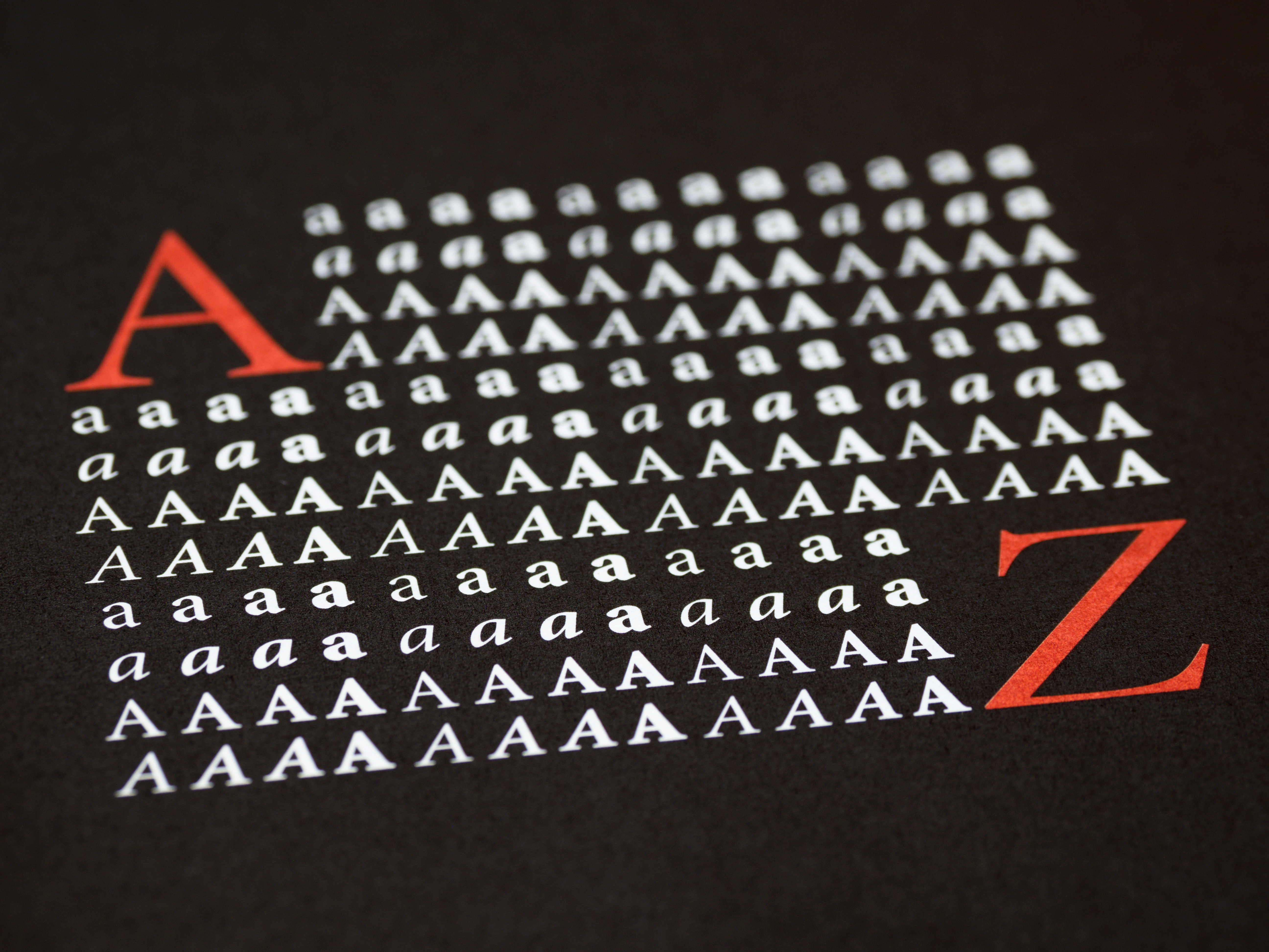
The main reason, one could argue is that it’s simply because serif fonts are generally accepted to be more classic, elegant and established. Sans Serif fonts have a more utilitarian goal - they are mainly used to convey short, direct messages in the simplest form possible (hence their use in road signs, plate numbers, TV commercials and modern company logos) whereas sans serif fonts are used to convey larger chunks of knowledge and data. While sans serif fonts are easier to recognize it small or low-resolution surfaces, serif typefaces are generally easier to read because the added strokes make each character more distinctive. More distinctive letters means words that are easier for the eye to recognize quickly.
There is also a historical context, nevertheless. The Latin alphabet, which comes from Greek and Latin was mainly written on stone tablets and the strokes (serifs) were usually a technical necessity. However since most of the Western legal and “formal” culture is based on Greek and Latin, this “original” writing style (based on classical Roman capitals) has always been accepted as being more deep rooted. While sans serif fonts can be traced back thousands of years, sans serif fonts were designed only in the late 19th century. It’s only with the advent of mass production, mass marketing and technologies such as digital printing that sans serifs has gained popularity. So one has a vast historical and artistic heritage behind it, while the other is modern, practical and geometrical.