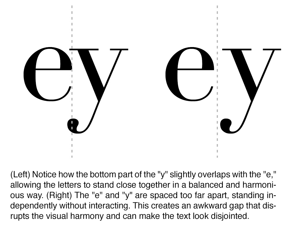
When it comes to design, the devil is in the details. One detail that often goes unnoticed by the untrained eye, yet plays a pivotal role in professional design, is kerning. This nuanced aspect of typography can mean the difference between a design that simply "looks okay" and one that is polished, professional, and visually harmonious. Today, we're going to delve into what kerning is, how it differs from tracking, and why it's so crucial in design.
Understanding Kerning
Kerning refers to the process of adjusting the space between two specific characters in a word. The goal is to achieve visually pleasing and balanced spacing, enhancing readability and aesthetic appeal. Kerning is particularly important in large headings, logos, and any text meant to draw attention.

Kerning has roots in the early days of movable type printing. In the 15th century, printers would modify individual metal type blocks to adjust spacing, ensuring that letters fit together without unsightly gaps. As typesetting evolved, so did the techniques for kerning. The digital age brought software that could automate these adjustments, a significant leap from the meticulous, manual process that preceded it.
Kerning vs. Tracking: What's the Difference?
While kerning deals with adjusting the space between individual character pairs, tracking is a similar but somewhat broader concept. Tracking (often referred to as letter-spacing) involves uniformly adjusting the spacing across a range of characters in a section of text. Imagine adjusting the tightness or looseness of an entire sentence or paragraph, rather than just focusing on two characters. Both kerning and tracking are vital tools in a designer's toolkit, but they serve different purposes and are used in different contexts.
Why Kerning is Important in Book Design
Kerning is particularly crucial in book layout and cover design, where every detail contributes to the reader’s experience and perception. Inside a book, proper kerning enhances readability by ensuring that the space between characters is visually pleasing and uniform. This reduces eye strain and helps the reader seamlessly flow through long passages of text, making their reading experience enjoyable and effortless. On the cover, kerning plays a vital role in achieving overall balance and professionalism. Well-kerned text ensures that titles, subtitles, and author names look cohesive and refined, capturing the potential reader’s attention and conveying a sense of high quality. This meticulous attention to detail in both the interior and exterior of the book highlights the designer's craftsmanship and dedication to producing a polished, marketable product.
Proper kerning ensures that your text is visually harmonious. Misplaced spaces can create awkward gaps, which can disrupt the reader's experience and distract from the design's message.
The Limitations of Automated Kerning
While computer algorithms for kerning have greatly improved, they are not infallible. Automated kerning tools can only follow predefined rules and lack the discernment of a human eye. Designers often find that manually tweaking kerning is necessary to achieve the best results.
While professional fonts tend to excel at automated kerning, offering refined and balanced character spacing, the vast landscape of typography includes tens of thousands of fonts. Among these, semi-professional fonts might seem suitable for your project, yet they often lack the meticulous fine-tuning necessary for a truly polished and professional design. Even with advanced software capabilities, relying solely on automated kerning for these fonts can lead to suboptimal results, leaving noticeable gaps or overly tight spaces. Therefore, it’s crucial for designers to remain vigilant and manually adjust kerning as needed to ensure that every element of the text meets the highest standards of visual harmony and readability. This attention to detail underscores a commitment to quality and professionalism that distinguishes exceptional design.
Algorithms can also struggle with contextual sensitivity. For instance, the spacing that works well in one word may not be suitable in another, even if the same characters are involved. A human designer can make these nuanced judgments better than a machine.
Kerning isn't just a science; it's an art. What looks good can be subjective and context-dependent, and a designer’s aesthetic judgment is often required to make text look truly polished.
Kerning might seem like a minor detail in design, but its impact on book covers and interior layouts is profound. Proper kerning ensures visual harmony, exudes professionalism, and significantly enhances readability.
A well-skilled designer understands the delicate balance of kerning, ensuring that each element of text contributes to a unified and professional appearance. This mastery not only enhances the visual appeal of the book cover but also reflects a commitment to creating functional and beautiful work. Within the book's interior, well-executed kerning facilitates a smooth reading experience, allowing readers to engage with the text effortlessly.
So, the next time you admire a beautifully designed book cover or effortlessly read through a well-laid-out text, take a moment to appreciate the craft of kerning—the invisible art that elevates design from good to exceptional. For designers, mastering kerning is not just a skill; it's a testament to their expertise and their passion for producing impeccable work that stands out in a crowded market.


