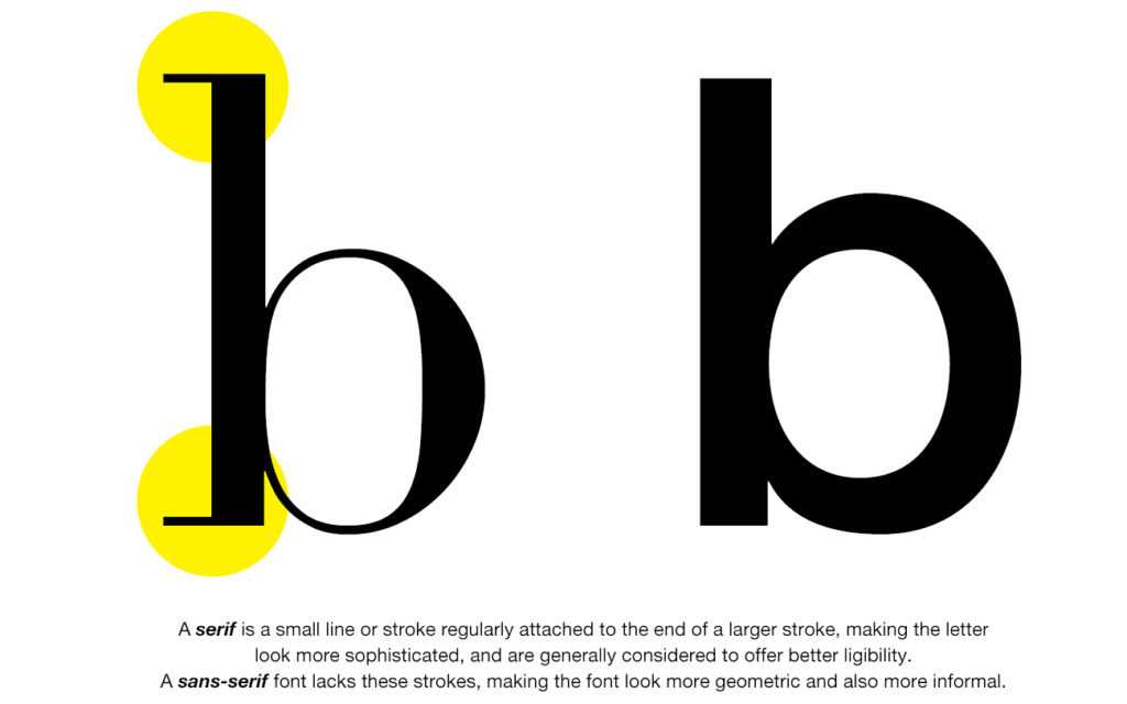
In the most general and historical sense, typefaces can be classified into two groups: serifs and sans-serifs. A serif is a decorative stroke that finishes off the end of a letter's stem (which is also called the “feet” of a letter). If the letter possesses this decorative stroke, it's called a serif font; if not, a sans-serif (sans meaning without).
Book layouts are by far and large almost always put together with serif fonts. Serifs are considered to be decorative first and foremost, but their appearance may well serve a higher purpose. While a sans-serif will look good on large-sized short texts (such as traffic signs, brochures, posters, or shop signs), for a continuous and uninterrupted reading experience a serif font will almost always be the better choice. Numerous readability studies have come to the conclusion that serif typefaces are easier to read because the added strokes along the central beams and the top bars make each character more distinctive. They also help the eye travel across a line. More distinctive letters are easier for the eye to recognize quickly. Serif letters have been the choice for books, newspapers, and magazines for centuries, due to both historical precedent and perceived readability. Serif typefaces tend to look a lot more traditional or conservative, compared to sans-serifs which are generally accepted to be modern and informal.
However, serif fonts have many shades. And depending on your book genre, there are numerous things to consider before settling on a typeface. Serif fonts are generally divided into three or four categories, based on their chronological development. We'll shortly go over these below.
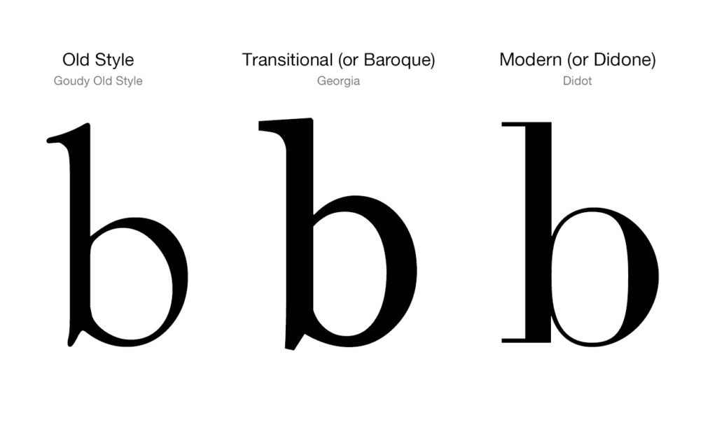
Old Style serif typefaces, which go back all the way to the 15. century are the most classical and traditional fonts you can find in today's modern desktop publishing environment. Thankfully, these typefaces have aged gracefully. Some of the most widely used typefaces today (such as Adobe Jenson, Centaur, and Goudy Old Style) belong to this group and are widely used in book layouts. Old Serif fonts can also be sub-categorized into Humanist and Aldine typefaces, but we won't go into this, because this distinction is somehow controversial as some historians believe it's an excessively abstract distinction and not based on specific formal or stylistic differences.
Next are fonts that belong to the "transitional" period. They're also referred to as baroque typefaces, as they became common around the mid-18th century until the start of the nineteenth century. Their most dominant characteristic is that the differences between thick and thin lines are more pronounced (especially when compared to old-style but less so when compared to modern fonts). Transitional fonts are those you'll mostly find in modern books. They're generally well-balanced, easy to print, and also easy to use in small point sizes on computer screens. Examples of these are Times New Roman, Baskerville and Georgia. And while some temporary fonts such as Minion Pro are less than 40 years old, they are nevertheless firmly anchored to this tradition of fonts and can be classified as transitional (or baroque) fonts.
For fonts with a definite contemporary vibe, Modern serif fonts come into play. The term Didone is also widely used for this family of typefaces. These are fonts that are not afraid of contrasts and offer some difficult challenges for printing presses. They are characterized by extreme contrast between thick and thin lines. They're as sexy and provocative as a font can ever be. Serifs (the hairlines) tend to be very thin, while the vertical lines are very heavy. The most famous of these is no doubt Didot (by the famous French printing and typeface family Didot), thanks to it being used in a variety of fashion magazines (such as Vogue or Harper's Bazaar). Other noteworthy examples in this family are Bodoni and Bernhard Modern. In contrast to the United States, Didone fonts are widely used for general-purpose body text, ie. book layout in Europe, so they're always worth considering. But bear in mind that they should preferably be used on high-gloss paper where the contrast of the thick and thin lines can clearly be distinguished and using the right optical size is also of uttermost importance with these typefaces. So experiment with them, before setting up your book with a modern serif font. Correctly used, they can do wonders, misused they'll make your book unreadable.
There is also a fourth category called Slab Serifs (also called mechanistic, antique, or Egyptian). Originally intended as attention-grabbing letterforms for posters, they have very thick serifs, which tend to be as thick as the vertical lines themselves. They can also be described as sans-serif fonts with added serifs. While certain typefaces such as Rockwell and Courier are still widely used, these are not very commonly used in the publishing industry. They are more often preferred in the software coding environment due to a variety of monospace fonts going with this style. Slab serifs can nevertheless be useful if your book includes large chunks of texts that are printed in very small point sizes.
Finally, a shortlist of which fonts are usually preferred for specific genres. This list is by no means written in stone but it should work as a starting point when selecting a typeface for your next book.
Typefaces for book layouts
| Literary fiction | Baskerville, Minion Pro, Goudy Old style, Bembo, Palatino, Century Old Style |
| Romance, Historical Fiction | Sabon, Garamond, Minion Pro, Playfair Display, Baskerville |
| Mystery, Thriller, and Suspense | Garamond, Playfair Display, Janson, Palatino, Century Old Style |
| Academic & Non-Fiction | Caslon, Bodoni, Minion Pro, Source Serif, Playfair Display |
| Science Fiction, Fantasy | Dante, Janson, Utopia, Latino, Bodoni |
Diren Yardimli
Co-founder,
Creative Director BookCoverZone
