


How to Create a Professional Book Cover
In the literary world, the adage "Don't judge a book by its cover" does not hold true. The stark reality is that a book is often judged, at first glance, by its cover. A professional-looking cover is not just about aesthetic appeal; it's a critical marketing tool that can determine a book's success. In this article, we'll explore the key elements that make a book cover look professional and how utilizing a professional premade book cover archive can be a game-changer for authors and publishers.
Key Elements of a Professional Book Cover:
- Striking Imagery: High-quality, high-resolution images are a must, ensuring that the cover does not lose its appeal in print or digital thumbnails. Professional designers typically source imagery from reputable stock photo websites, commission custom illustrations or photographs, or use their own original artwork. At BookCoverZone we are mostly using reputable stock image services, but we take full advantage of photo manipulation and AI powered tools. We employ advanced design software to enhance and manipulate images, applying filters, adjusting colors, and combining elements to create a composition that pops. Careful attention is paid to intellectual property rights and licensing to ensure the imagery is legally cleared for use. The end goal is an evocative, memorable image that immediately draws the eye and stirs curiosity, capturing the potential reader's attention in a sea of book covers.
- Legible and Appropriate Typography: Typography is a pivotal aspect of book cover design because it not only conveys the book's title and author but also plays a significant role in the overall aesthetic and emotional impact of the design. The choice of typeface, size, color, and placement can express the mood or genre of the book—serif fonts might evoke a sense of tradition suitable for a classic novel, while bold sans-serif fonts could suggest a modern and straightforward approach appropriate for a non-fiction title. Typography guides the reader's eye and helps establish a visual hierarchy, ensuring that key information is immediately evident. Moreover, well-executed typography is essential for readability, especially when the cover is scaled down to thumbnail sizes on digital platforms. A cover with effective typography can impart the book's character and draw the interest of potential readers, transforming a simple title into a powerful and visually compelling element of the cover's design narrative.
- Balanced Layout: A professional cover has a well-structured layout with a clear visual hierarchy. Unless you are a famous author and the author's name is the driving force behind sellign the book, the title should stand out as the most prominent text element, followed by the author's name and other necessary details. This equilibrium is crucial in establishing a professional and inviting appearance. Designers achieve balance through symmetry or asymmetry, often employing a grid system to proportion the space effectively. By strategically placing these components, a balanced layout not only captures attention but also aids in readability and creates a visual narrative that can intrigue and beckon potential readers at first glance
- Targeted Design: Targeted design in the publishing world is a strategic approach where book covers are meticulously crafted to appeal to a specific demographic or interest group, ultimately influencing consumer behavior and increasing sales potential. This involves a deep understanding of the book's content, the intended audience's preferences, and current market trends. The design elements, including imagery, color palette, typography, and overall aesthetic, are carefully chosen to resonate with the anticipated readers, providing visual cues about the genre and tone of the book. For instance, a romance novel might feature warm hues and intimate imagery, while a science fiction title may boast futuristic fonts and stark, bold graphics. By aligning the cover design with readers' expectations and desires, publishers can create an instant connection between the book and its intended audience, making the product more enticing and marketable..
- Consistency with Branding: For authors with multiple books, maintaining a consistent branding or style across all covers is key to building a recognizable author identity and fostering reader loyalty. This consistency can be achieved by adhering to a set of design standards that may include using the same font family for the author's name and titles, applying a signature color palette, and utilizing recurring graphic elements or compositions that align with the author’s brand. For series works, thematic continuity is especially important, which could involve similar layouts or a common emblematic motif to visually link the books. Even when the content varies, a uniform approach to branding elements—like logo placement, typography style, and cover finish—can give diverse works a cohesive feel. As a result, readers can quickly identify the author's work on bookshelves or online platforms, ensuring a professional, branded presence that stands the test of time and differentiates the author in a competitive marketplace.
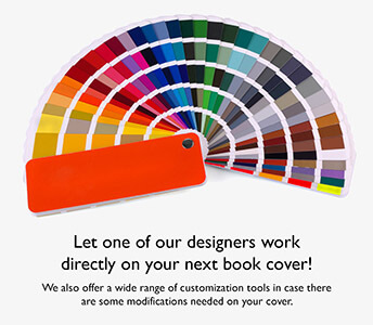
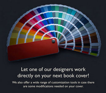
- Color Scheme: Colors have psychological impacts. A professional cover will use a color scheme that fits the genre and tone of the book while also taking current market trends into account.
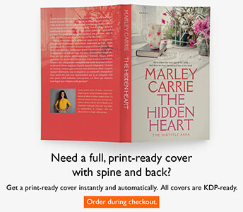
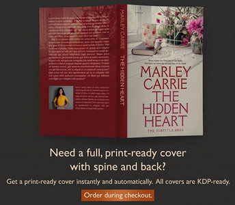
How a Professional Premade Book Cover Archive Can Help:
Premade book covers are ready-to-use designs for book covers created by professional designers. These covers are often sold through archives or online marketplaces that cater to authors and publishers. Here's how they can benefit you:
- Cost-Effectiveness: Designing a unique book cover from scratch can be expensive. A premade archive offers professional designs at a fraction of the cost.
- Time Savings: With premade covers, the turnaround time is significantly shorter because the base design is already complete. Quick customization can align the cover with your book's specifics.
- Variety of Choices: A well-stocked premade cover archive offers a multitude of styles and themes, providing authors with a wide range of options to find a cover that resonates with their work.
- Quality Assurance: Premade covers are crafted by experienced designers who are familiar with the elements of a professional cover. Consequently, quality is built into the design.
- Market-Ready Designs: Designers creating premade covers often keep a pulse on current market trends and reader preferences, meaning these covers are already optimized to appeal to your potential readers.
A professional book cover is the gateway to your narrative, the first point of engagement for potential readers, and a silent ambassador for your work. Not everyone has the resources or time to commission a custom design, which is where a professional premade book cover archive can be invaluable. It provides access to industry-standard designs, ensuring your book stands out in already crowded marketplaces. Remember, investing in a professional book cover is investing in your book's future, and with the right cover, the story within has a greater chance to be discovered and appreciated by readers around the world.