


How to choose a color for your book cover design
What is the first thing your brain analyzes when you see a book on a bookshelf? It's not the title or the author's name, it's not the character on the cover image. It's not the genre, or the price tag. It's not the thickness or the binding type. The first thing the brain intercepts, before even you are aware of it, is the overall color of the book cover. Until the title of the book is captured consciously and rationally (many seconds later), the color has already reached you and conveyed to you numerous messages about the book. Color is a sneaky tool and affects the area of the brain where the person is most vulnerable, the area he or she can't control -the subconscious. Before we can consciously contemplate, judge, like or dislike something we have to be aware of it. And colors, by far and large is the greatest tool in that split second. All through our lives, our subconscious races before us and is selecting things that is worthy of our conscious observation and exploration.
In the most broadest sense there is nothing rational about colors. They are there as a communication tool that instantly stimulates a variety of emotions from excitement to frustration. Because of this they are a very influential source of information when people are making decisions. Used wisely colors can be the main driving force of someone grabbing your book, used foolishly they will shy the customer away from your book.
What is color anyway?
Today the color wheel is a wheel of imagination and symbolism. So before going further, a bit about color theory. If you would like to read about what colors work for what genres without going into the theoretical part you can just scroll down to the Genre Colors section. If not, here we go:
As humans, we are trichromats—meaning that we have three types of color receptors (retinal cones) sensitive to long (red), medium (green), and short (blue) wavelengths. In fact, we're one of the few trichromat species on this planet, most others are dichromats, with only two types of cone. Trichromatic color vision is the ability of humans and some other animals to see different colors the way we see them. To put it bluntly, in themselves, the colors that we see don't have any specific meaning or symbolism. They're just wavelengths of light that are reflected from an object. But our cultures and our living environments throughout millennials have bestowed upon them numerous emotional and symbolic meanings. And this is from where we attach meaning to colors. Let's try to empathize with a cave person from tens of thousands of years ago. Green and brown were probably "natural", blue was "as eternal as the sky", orange was warm (due to the sun) and mostly edible (thus friendly), and red (very complicated!) was the color of burning, pain, blood and ultimately power. White, on the other hand, was as calm and pure as the snow covering the hills and black was as mysterious (and dangerous) as the night was. As the cave person evolved and became a member of today's modern society numerous other values were added to the colors. Pink became "girlish", purple became "neurotic" or "erotic" and black became "evil".
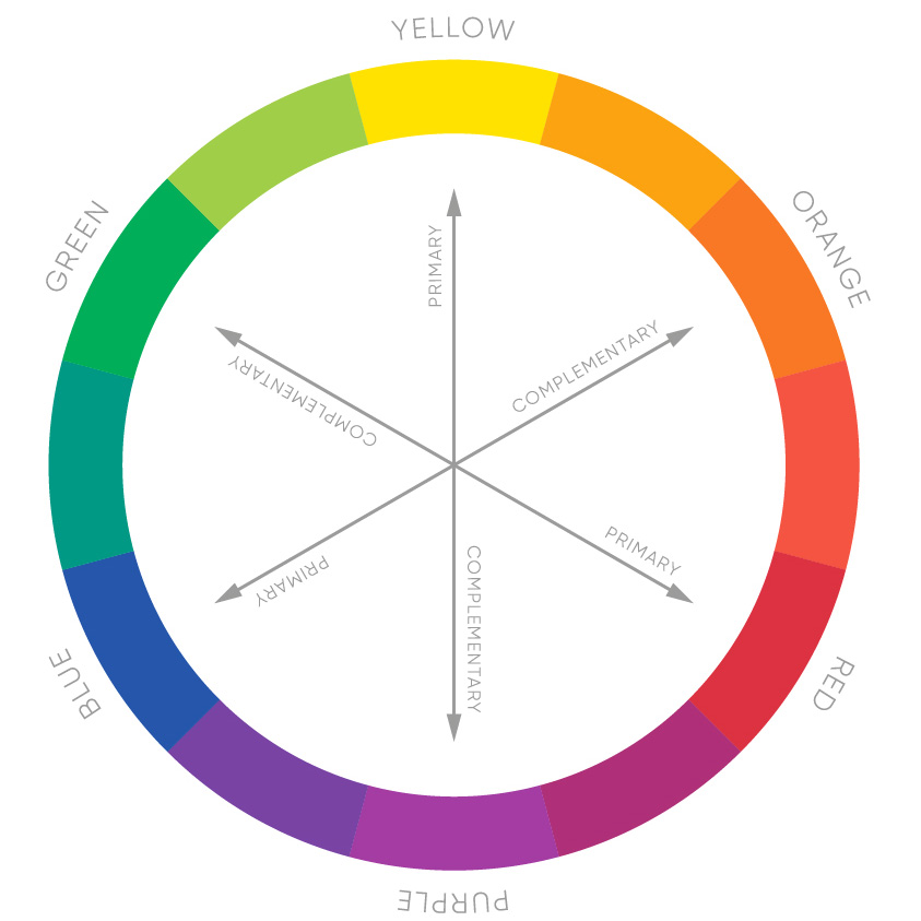
Apart from this, there is also a neuronal side to it. Further down the color theory, complementary colors (those found opposite one another on the color wheel) will create energy and punch (due to them being opposites), while analogous colors (those next to one another on the color wheel) provide tranquility and harmony as they are neighboring each other.
Genre Colors
People tend to have powerful emotional reactions and associations with colors. Color psychology is the study of hues as a determinant of human behavior. And it's not just in books. In medicine, red or orange pills are generally used as stimulants, while cool-colored pills work better as depressants. Blue light causes people to feel relaxed so has lately been installed as street lights in many cities in order to decrease suicide rates. Children's toys are often categorized as either boy's or girl's toys solely based on color.
So let's finally get to the colors.
Based on a variety of researches each color has a certain subconscious message or feeling attached to it. Let's see how they work on book covers.
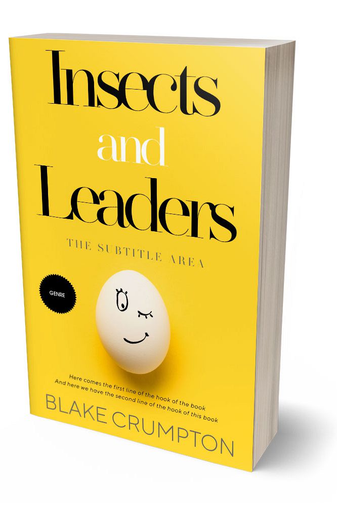
Yellow stimulates imagination and brain activity. It can evoke feelings of competence and happiness, but can also mean something is inexpensive or low quality. So should be used wisely. It will work well with action-paced novels or self-help books where happiness is the core idea. Yellow is probably the most "personal" of all colors and is thus used on a variety of personal items (such as Post-Its) so can go well with "intimate" stories. It's a fun color. But it's also majestic. It's the color of bananas, but also the color of our mighty sun.
Violet or purple is generally about sensuality and spirituality where book covers are concerned, but can also mean sophistication and authority. Purple is an excellent color choice where erotica or royal romance books are concerned. The color is filled with passion, glory, and mysteriousness. As such, it can also easily be used on science fiction and fantasy novels. It can be considered the most "futuristic" color of them all. Just stroll through the sci-fi aisle of a book store and you'll get the idea.
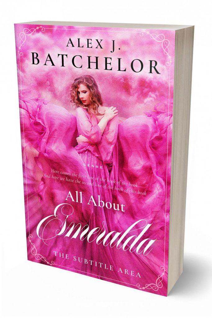
Pink brings youth, playfulness, emotion, and dreams. It's generally the color of sincerity and innocence and whether we like it or not, is the ultimate color of femininity. (Yes, even today.) Hence chick-lit covers using pink unapologetically, but it will also work well for teen and young-adult novels.
White is clean, straightforward, self-sufficient, and pure. It's an excellent choice specifically for non-fiction books as well as books that seek to obtain a certain level of minimalism on their design. Many poetry books are using white for this specific reason. White books are generally used on scientific, sociological, or psychological titles to make them seem less "academic" and "intellectual" and bring them over to the popular sections of the book stores. White is also the number one choice for business titles and is usually used alongside orange, blue, and black.
Black evokes the feeling of authority, power, and a sophisticated lifestyle. It always finds itself a place in the Mystery Thriller aisle of a book store. Black is serious and even though the title is a pageturner, a flick buster, black is used to make it seem deep and dramatic. Black, which many argue is not even a color (although printer inks would tend to disagree) can work everywhere. It will work for fiction as well as non-fiction titles. However, when going with black designs it's always a great idea to put a light source or a contrasting bright color on it. Otherwise, it will seem dull and one-dimensional.

Then we have green. As expected green is used for environmental and ecological books, but it is also a fundamental color for vitality and health. Green, different from other colors can have very different meanings based on its saturation and brightness. Think of it, Starbucks is green, but so is a field of grass. And while Starbucks green is used as an "elegance" element, the field of grass is a playground with joy and happiness.

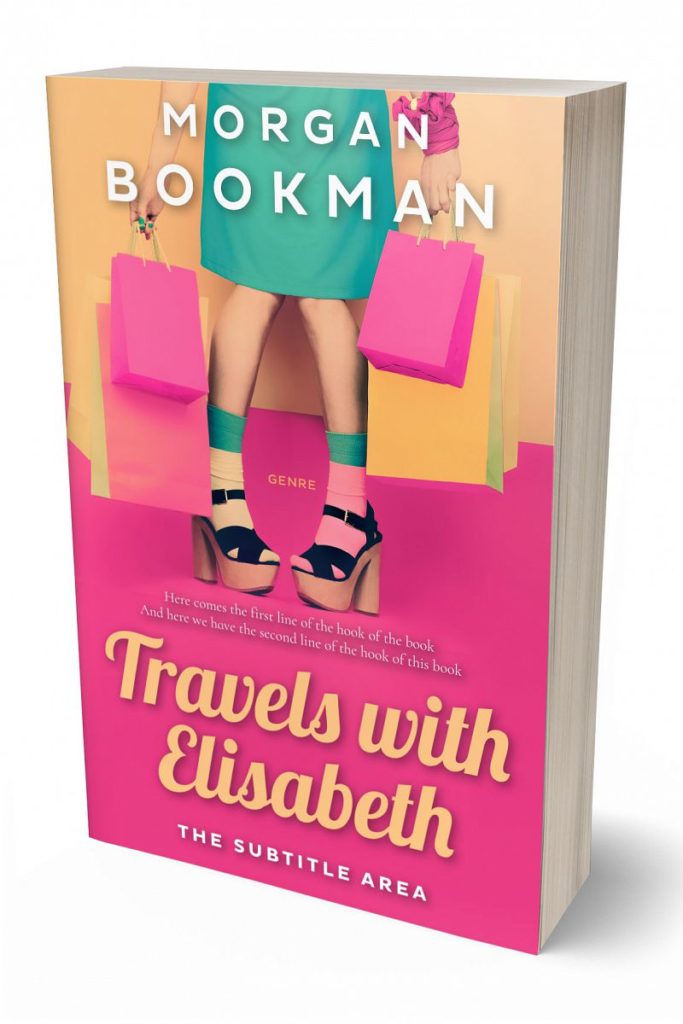
Orange too is the color of joy, pleasure, the pursuit of achievement. Analytically speaking orange, the blend of red and yellow, is a mixture of the energy associated with red and the happiness associated with yellow. Studies show that orange increases hunger, heightens sense of activity, and increases socialization. Now of course keep in mind that these are all cultural associations. There is nothing hungry or social about orange as a color. But for centuries it has been analogous with these concepts. And this is exactly why it's a perfect color of choice for self-help and business book.

And finally red. Red is a vibrant, stimulating, and exciting color with a strong link to sexuality. According to Scientific American it's the color of Cupid and the Devil, the color of love and hate. For hundreds of years, matadors have taunted bulls by flashing a red cape. In some species, red coloration signals testosterone-driven dominance. Red is, by all means, the most powerful color on the color spectrum. One reason for this is that its effect is not only psychological but also physiological. It increases heart rate, boosts energy levels. There is a reason it's the color of stop signs, danger warnings, and fire extinguishers, but also of lipsticks, flamenco, and the iconic scarlet soles on Christian Louboutin shoes. One technical problem with red though is that it's difficult to print. Now we won't go into the technicalities of printing here, but keep in mind that while we can see a bright and strong red on our screen due to screen pixels directly containing a red light source, on printed materials red is only obtained by mixing other colors. Red is not a primary color where printing presses are concerned. And as you mix colors you will always lose saturation. So a red you see on the screen will almost never be the red you see on the book cover.
And that's it. A short glimpse into the wonderful world of colors. We'll have more on this later though. There are millions of millions of colors and each one of them has a story to tell.
- Diren Yardimli
Creative Director, BookCoverZone