


THANK YOU!
 YEARS IN SERVICE. WE HAVE PROUDLY SERVED 10.000+ AUTHORS & PUBLISHERS WORLDWIDE WITH BOOK COVERS CURATED BY INDUSTRY-LEADING DESIGNERS.
YEARS IN SERVICE. WE HAVE PROUDLY SERVED 10.000+ AUTHORS & PUBLISHERS WORLDWIDE WITH BOOK COVERS CURATED BY INDUSTRY-LEADING DESIGNERS.
Latest Posts
★ Featured
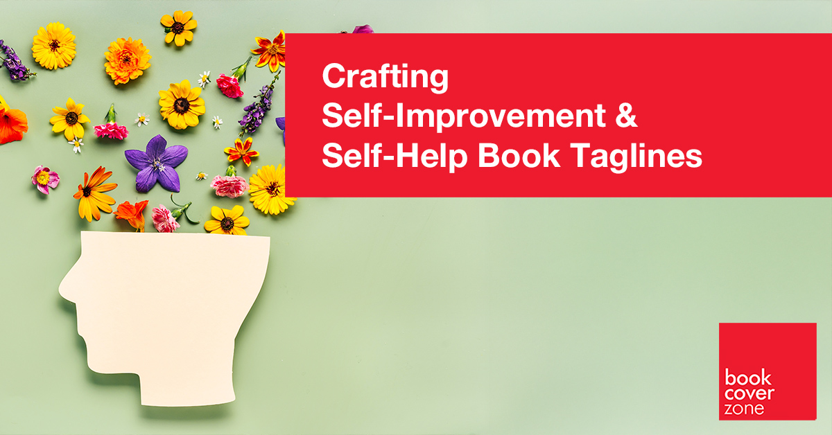
Crafting Self-Improvement & Self-Help Book Taglines
In the Self-Improvement genre, your reader isn't buying a book; they are buying a better version of themselves. They are likely browsing A...
Read More →
★ Featured
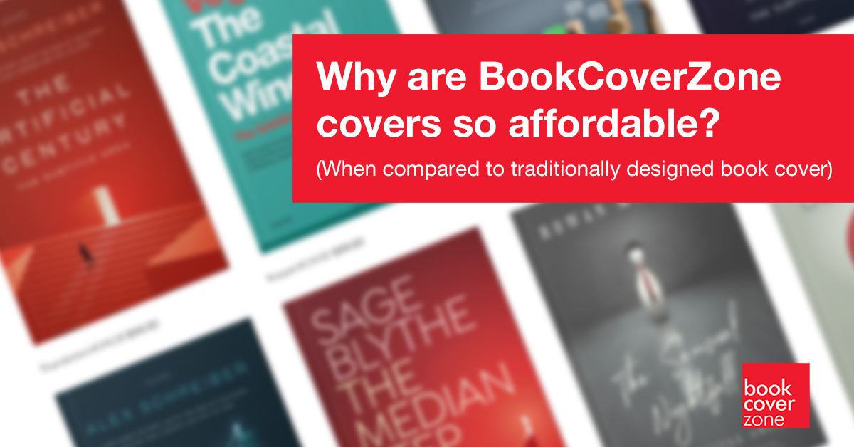
Why are BookCoverZone covers so affordable? (When compared to traditionally designed book covers)
At first glance, it can be surprising that BookCoverZone offers premium-looking covers at a fraction of traditional custom design prices. It's natural...
Read More →
★ Featured
Behind the Pixels: The BookCoverZone Difference
Unveiling the Only Photoshop-Powered Design Engine in the Industry
At BookCoverZone, we believe every aut...
Read More →
★ Featured
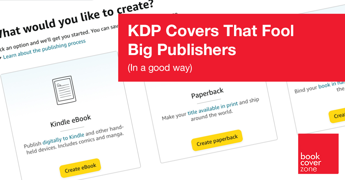
KDP Covers That Fool Big Publishers (In a Good Way)
Maximizing Your KDP Impact
From Self-Published to Established
If you’re publishing on Amazon K...
Read More →
★ Featured
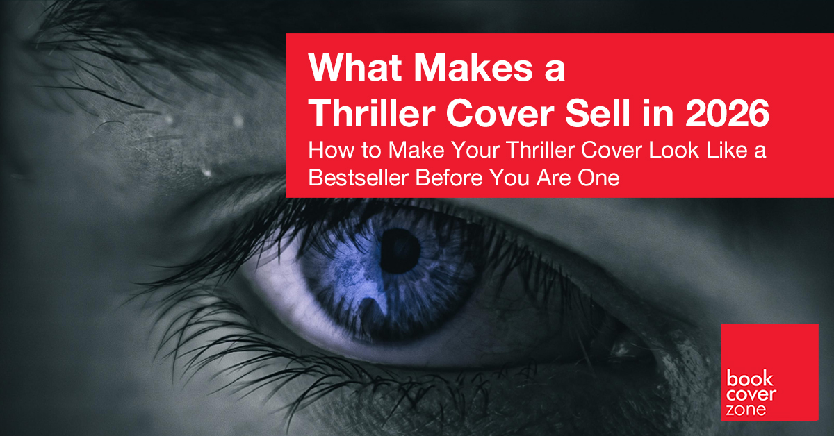
What Makes a Thriller Cover Sell in 2026
Thriller covers have to stop scrollers dead on Amazon thumbnails—where most sales happen in a blink. Here's what actually moves copies this year...
Read More →
★ Featured
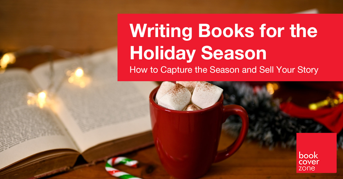
Writing Holiday Books: How to Capture the Season and Sell Your Story
As an author, you have a wonderful opportunity with the holiday season to connect deeply with readers who are craving stories that bring warmth, hope...
Read More →
★ Featured
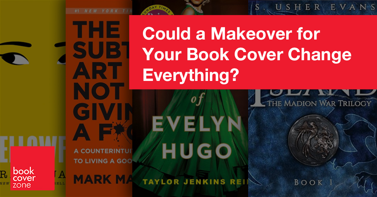
Could a Makeover for Your Book Cover Change Everything?
Yes! We live in an age of design. Victor Hugo might have gotten away with a plain brown wrapper for Les Misérables, but today’s readers expect mor...
Read More →
★ Featured

Choosing the Right Size For Your Book: A Short Guide to Book Cover Dimensions
When it comes to creating a book cover, one of the most crucial elements is getting the dimensions right. Whether you're publishing a novel, a memoir...
Read More →
★ Featured
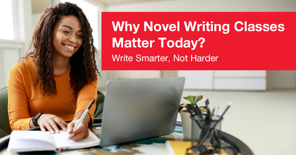
Write Smarter, Not Harder: Why Novel Writing Classes Matter Today
Writing a novel is often cherished as one of the most personal yet universally accessible forms of creative expression. Writing a novel is an ambitio...
Read More →
★ Featured
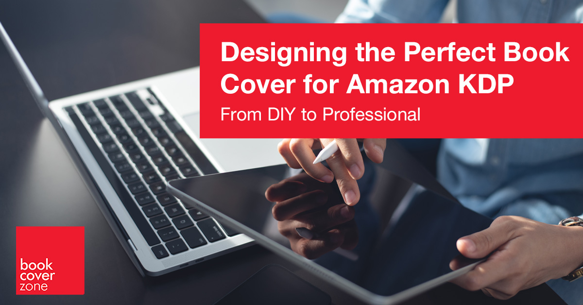
Designing the Perfect Book Cover for Amazon KDP
In the realm of self-publishing, your book cover serves as the virtual storefront for your literary work. It’s the first impression potential reade...
Read More →