


Latest Posts

Book Cover for Sale! Why premade book covers might be the best choice for your next novel.
Premade does not mean mediocre. Premade does not mean ordinary. Quite on the contrary a premade book cover is many times the work of a bold spi...
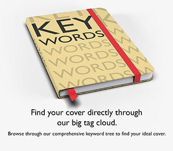
How to find the perfect design for your book
As our premade book cover catalog is expanding day by day, it might start getting difficult or too time-consuming to find a cover that matches ...

How much of the story should a book cover tell?
This is a question we get asked a lot. And this is one of those places where there is a great distinction between a movie poster and a book ...

When should you reveal your book cover?
As with every new product that's about to hit the market, a sneak preview is always an excellent way to stir some excitement and start some discussi...

Write Smarter, Not Harder: Why Novel Writing Classes Matter Today
Writing a novel is often cherished as one of the most personal yet universally accessible forms of creative expression. Writing a novel is an ambiti...
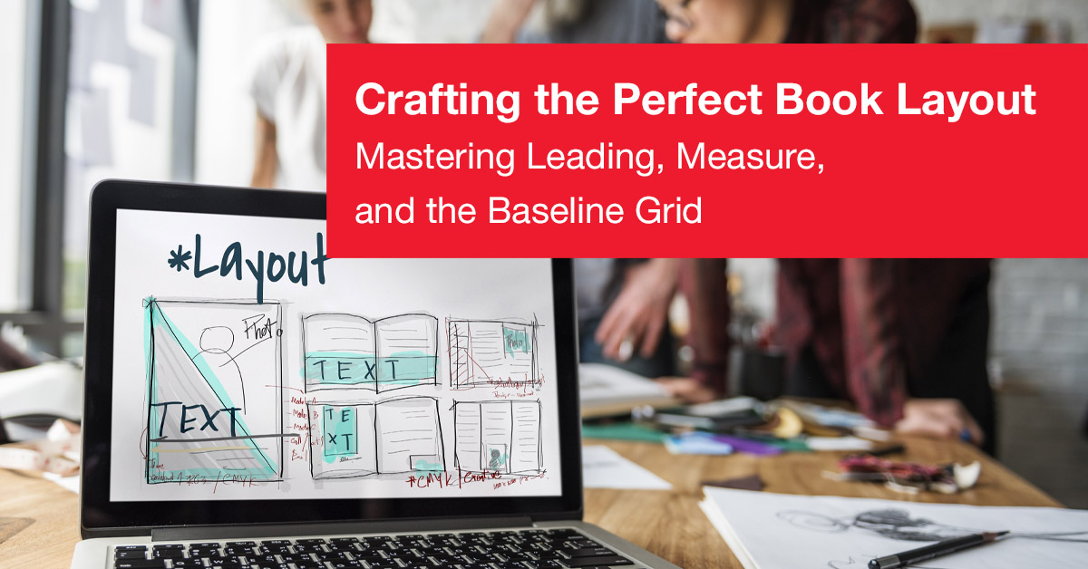
Crafting the Perfect Book Layout
The Invisible Symphony How to Get the Right Layout For Your Books I've seen people pick up a book and before they even start readi...
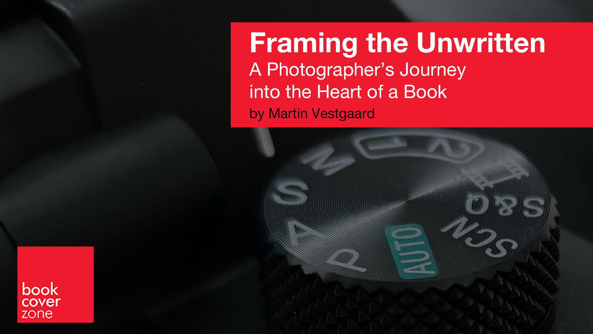
Framing the Unwritten: A Photographer’s Journey into the Heart of a Book
You might think that being a book cover photographer is just about taking great pictures. While that’s part of it, there’s an en...
ElevenLabs for Authors: Fast, Affordable, and Not Quite Hands-Off
BookCoverZone Audiobook production used to feel like a premium add-on reserved for authors with big budgets. ElevenLabs changes that by...
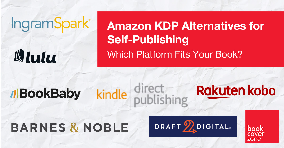
Amazon KDP Alternatives for Self-Publishing: Which Platform Fits Your Book?
Amazon KDP may be the biggest name in self-publishing, but it is not the only route to publication. Many authors now build a wid...
Why are BookCoverZone covers so affordable? (When compared to traditionally designed book covers)
At first glance, it can be surprising that BookCoverZone offers premium-looking covers at a fraction of traditional custom design prices. It's natural...