These are exciting times not just for authors, but also for publishers, designers and everyone who has one foot in the publishing industry. While the century-old process of getting published changes rapidly, as does the means in which we publish, the quantity of books published is skyrocketing. Pre-made book cover designs are the new kids in the block and a great way for authors and publishers to find a easy, professional and budget-friendly solution to to their publishing needs. Pre-made book cover designs are a great way, not just for literary/fiction authors but also for self-help, science and business books.
Turning ideas into symbols...
Fiction book designing is about creating a world, an atmosphere and setting an overall mood; a good business book cover is all about ideas, abstractions and clever use of typography. It's a personal corporate branding project. It's rational, rather than emotional. It's attentive, rather than passionate. Instead of working with textures, shades and perspectives, it's a genre where striking symbols, challenging ironies and clever use of analogies is there to make the best use of. A piggy bank is a symbol of personal saving, an arrow symbolizes growth in venue, keys are real estates and a sand glass is time management. A short browse through business books will immediately present dart boards, light bulbs and gearwheels in the plenty. And while these are clichés in every sense of the word, they still work. In fact, symbol are delicate things, and "over-symbolization" can easily have an undesired effect and make the whole design ambiguous and confusing. A designer has a tendency at times to forget that not everyone is a designer. Conventional approaches, on the other hand, works all the time. As of the writing of this article, the top ten business book covers on the New York Times Bestseller list consists of personal portraits, pencils, rubbers and gear wheels. Not exactly a beacon of imagination but a definite proof that clichés work.

... and numbers into narratives
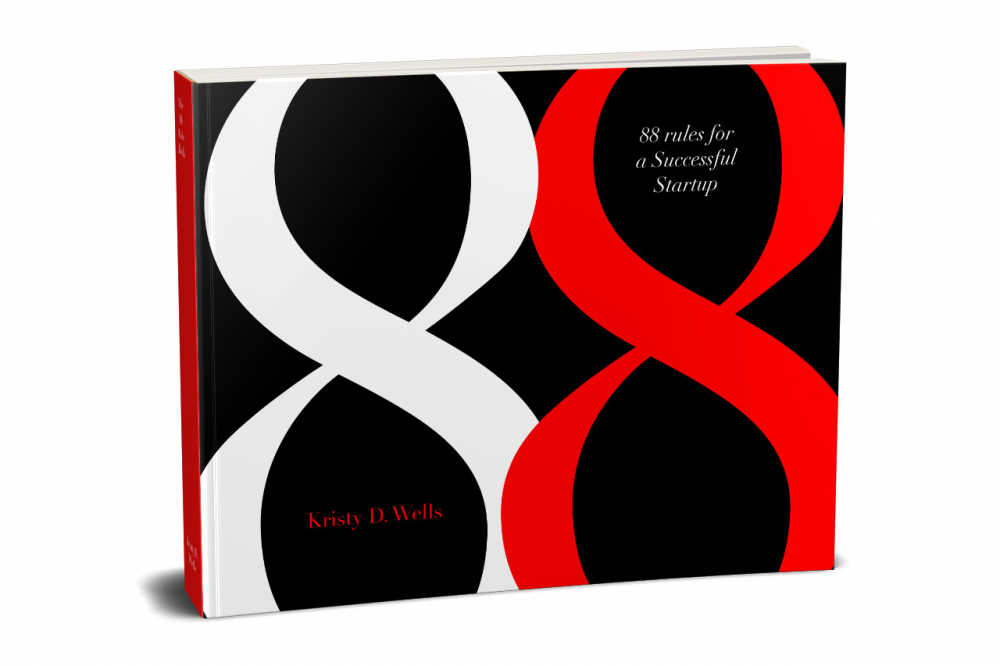
And then we have numbers. Since business is eventually about statistics and numbers, using them on covers might seem to make good sense. But there is a problem - numbers are cold, impersonal and to many, openly frightening. So how do we make them intimate and alluring? By clever use of typography and color. Numbers can be exciting and as personal as it gets, once we start looking at them not as digits or mathematical symbols but as geometrical shapes. Every shape has some imminent emotions attached to it. Squares, lines, and triangles suggest structure, strength and organization. Circles imply positivity, relationships, and community. Symmetrical shapes suggests balance, while sharp angels brings dynamism and suspense. The number 8 is so full of meanings that it couldn't fit inside a whole book. It's rounded, it's symmetric and it's shape is continous. It's as sexy as a number can evet get (sharing the spot with 6). More interestingly, while the infinity symbol ∞ is symbolically completely unrelated to the number 8, it's visual similarity is indisputable and to the observer, many of the positive feelings attached to ∞ are also unconsciously present in 8. Apart from its geometrical meanings, it's non-mathematical symbolic meaning is also powerful. In Buddhism, the 8-spoked Dharmacakra represents the Noble Eightfold Path. In Christianity it was the day God created light and also the day Jesus resurrected. In Islam it's the number of gates of heaven and also the number of angels carrying the throne of Allah in heaven. Eight is also the lucky number in various cultures. It's power is so vast that the opening ceremony of the Summer Olympics in China began on 8/8/08 at 8 seconds and 8 minutes past 8 pm. Spiders have eight legs, octopus has eight arms, there are 8 planets in the Solar System, and the light of the Sun reaches us in 8 minutes. All these interesting attributes of 8 has turned it into a powerful symbolic numeral in our psyche. 3, an equally compelling number, is symbolically rich because it is present in everything we observe around us. (In fact, it's the number of dimensions in which we observe the world). Optically it's pleasing to look at, since it's repeating, it's got two incomplete circles and it looks very much like organs such as breasts and buts. For mathematicians, physicist as well as designer it's simply the holy number due to it being π. Three also has religious significance because it represents the Trinity, the soul, the union of body and soul in human in the church. Hegel's Dialectics is based on 3 states or moments (Nothing - Becoming - Being). [Dialectics in design is a fascinating matter in itself. It is based on the idea that the expressive potential of design for the maker, the user and the designer exists in tension with other desirable properties of the designed artefact.] In everyday life, we have three prizes in competitions, we count to three before starting on something. It is the first number that forms a geometrical figure – the triangle. With a little bit of imagination, we could base the entire human civilization and the fabric of nature on the number 3.
