


Poetry is the architecture of silence. On a book cover, the typography doesn't just name the work—it sets the meter, the mood, and the space between the thoughts.
When we design a poetry cover here at BookCoverZone, we are working with a genre where "less" is almost always "more." Poetry readers are sensitive to rhythm and aesthetic balance. The typeface shouldn't compete with the imagery; it should breathe with it. We treat the title as a line of verse itself—positioned with care, weighted with intent, and surrounded by the "white space" that allows the reader’s imagination to take flight.
The Academic Soul: Classic and Elegant Serifs
For "Literary Poetry" and collected works—think of the "Oxford" or "Penguin Classic" aesthetic—Traditional Serifs are the undisputed language of the genre. We look for fonts that carry the weight of history and the precision of the printing press. Typefaces like Adobe Caslon, Baskerville, and Sabon are our go-to choices.
When we use these at BookCoverZone, we focus on "Dignity." We often use lighter weights and increased tracking (letter spacing) to give the words a sense of importance. These fonts suggest a story that is grounded in tradition, academic rigor, and timeless beauty. By keeping the layout centered and symmetrical, we signal to the reader that they are about to engage with a work of lasting significance.
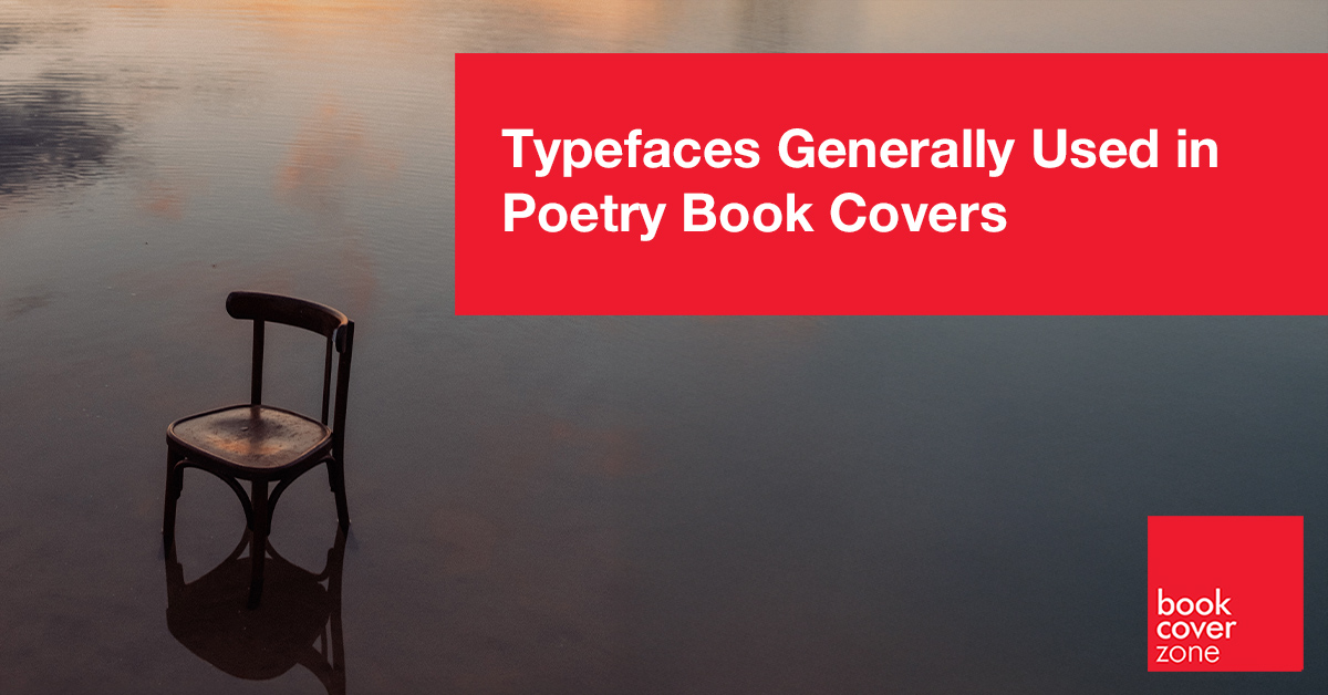
The Avant-Garde: Modernist and Stark Sans Serifs
For contemporary, experimental, or spoken-word poetry, we often shift toward Minimalist Sans Serifs. These fonts provide a "clean" slate, suggesting that the work inside is visceral, modern, and perhaps a bit defiant. Typefaces like Futura, Helvetica Neue (especially the Light or Thin weights), and Montserrat provide the necessary clarity.
At BookCoverZone, our "Modernist" secret is in the "Unconventional Alignment." We might place a small, thin sans-serif title in a bottom corner or vertically along the side. This asymmetrical approach tells the reader that the poetry inside breaks the rules. It suggests a voice that is fresh, urban, and perhaps a bit raw—perfect for a new generation of poets who are redefining the medium.
Market Snapshot: The Rise of "Instapoetry" and Abstract Minimalism
The broader publishing market for poetry has seen a massive shift driven by the "Instapoetry" phenomenon (popularized by authors like Rupi Kaur). This trend has popularized a very specific look: Small, Lowercase Sans Serifs (like Avenir or Courier) centered against a vast field of white space, often accompanied by a single, simple line drawing.
At BookCoverZone, we've also noticed a trend toward "Tactile Abstract" covers. This involves using bold, high-end serifs (like Ogg or Canela) that overlap with abstract, hand-painted textures. This trend bridges the gap between the "Timeless" and the "Trendy," creating covers that feel like collectible objects or pieces of modern art. It’s a move toward making poetry books feel as "Instagrammable" as they are intellectual.
The Personal Note: Handwritten and Typewriter Fonts
For intimate memoirs in verse or "confessional" poetry, we lean into Typewriter or Subtle Handwritten fonts. We want the title to feel like a secret shared between the poet and the reader. Fonts like Special Elite or very clean, non-decorative scripts mimic the look of a journal or a letter.
The trick at BookCoverZone is to avoid making it look too "cluttered." We use these fonts sparingly—perhaps just for the title—while keeping the author's name in a clean serif. This contrast suggests that the book is a published work of art, but the voice inside is raw and personal. It tells the reader they are holding a piece of someone's heart.
Typeface Hacks For Poetry Books
Poetry typography is all about the "Visual Pause." Here are the secrets we use at BookCoverZone to make your poetry title feel like a masterpiece:
1. The "All-Lowercase" Rule: For a contemporary, accessible feel, try setting the entire title in lowercase. This removes the "authority" of the capital letter and makes the title feel more like a quiet thought than a loud statement.
2. Extreme Tracking: Take a very simple, thin font and set the letter spacing to +200 or more. This "airs out" the title, making it look expensive, literary, and high-end.
3. Vertical Stacking: Try placing each word of your title on a new line, even if it’s just a three-word title. This "stanzas" the title, forcing the reader to slow down and read each word individually, just as they would with a poem.
4. Transparency Layering: We often set the text to 70% opacity over a soft texture. This makes the words look like they are "sinking" into the paper or fading into a memory, perfect for elegiac or nostalgic poetry.
5. The "Signature" Placement: Place the author’s name in a small, clean font at the very bottom, away from the title. This "signature" look makes the book feel like a limited-edition art print, increasing its "giftability" and prestige.
A poetry book is a sanctuary for the soul, and the cover is its threshold. At BookCoverZone, we specialize in making that threshold as beautiful as the words within. Whether you are looking for a minimalist premade design that captures a modern vibe or a custom cover that builds a world out of ink and air, our designers are here to help your voice be heard.