


Music is the literature of sound. On a cover, the typography acts as the conductor—setting the tempo, defining the genre, and capturing the specific frequency of the narrative before the first note is played.
When we design a Music book cover here at BookCoverZone, we are designing for "Rhythm" and "Iconography." Music books cover an eclectic range of sub-genres: from raw, high-energy rock biographies and intimate jazz memoirs to dense music theory textbooks and historical cultural analyses. In our studio, we treat the title as a visual soundwave. Is it a loud, distorted display font that echoes a stadium tour? Or a precise, mathematical sans-serif that mirrors the structure of a symphony? We ensure the typeface choice validates the reader's passion for the sonic world.
Pondering the Performance: Iconic Identity vs. Technical Clarity
The central question in music cover design is whether the book is about the *feeling* of music or the *mechanics* of it.
The Iconic Approach: For biographies, memoirs, and genre histories (Rock, Punk, Pop), we use "Personality Typography"—fonts that look like they belong on a concert poster or a vinyl sleeve. These covers signal that the content is experiential and human. The upside is immediate emotional "buy-in" from fans; the risk is becoming so stylized that the title becomes difficult to read in a digital thumbnail.
The Technical Approach: For theory books, instructional guides, and classical analysis, we favor "Precision Typography." These are clean, high-legibility fonts that suggest order, logic, and mastery. The upside is professional authority; the risk is appearing "academic" and losing the creative spark that music implies.
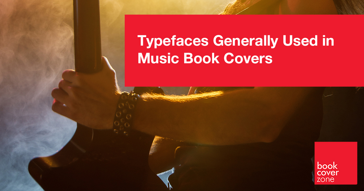
The Rockstar Voice: Bold Display and Distressed Fonts
For biographies and rock histories, Bold Display and Distressed fonts are the backbone. We want fonts that feel like they have a history—weathered, loud, and unapologetic. Typefaces like Bebas Neue, Impact, or custom-weathered Stencil fonts are industry favorites.
When we use these at BookCoverZone, we focus on "Stage Presence." We often utilize massive, all-caps layouts that dominate the visual space. By adding textures like "amplifier grit," "grainy photocopy noise," or "neon glows," we create a look that feels alive and amplified. It tells the reader that the information inside is loud, authentic, and potentially rebellious.
The Rhythmic Grid: Modern and Geometric Sans Serifs
For music theory, instructional manuals, and modern pop-culture analysis, we move toward Geometric Sans Serifs. We want the title to look like it was composed on a digital workstation. Typefaces like Montserrat, Futura, and Gotham provide the necessary "beat."
At BookCoverZone, our "Rhythmic" secret is in the "Syncopation" of the layout. We look for fonts with balanced, circular forms that mirror the mathematics of time signatures. By pairing these with a palette of "Electric Violet," "Synthwave Pink," or "Turntable Black," we create a visual language of modern, structured creativity.
Market Snapshot: Analog Revival and Soundwave Abstraction
The broader publishing market for Music books has shifted toward "Analog Revival." Reflecting the vinyl resurgence, latest trends involve covers that mimic 12-inch record sleeves, complete with "ring wear" textures and Bold, Retro Serifs (like Cooper Black or ITC Avant Garde).
We've also seen a rise in "Visualizing Sound." This trend uses minimalist, abstract graphics—like waveform lines or equalizer bars—paired with Wide-Tracked, Thin Sans-Serifs. The typography in this trend mimics the UI of a high-end audio interface, signaling to the reader that the book provides a sophisticated, data-driven look at the science of sound.
The Classical Heritage: Timeless and Elegant Serifs
For orchestral history, composer biographies, and traditional jazz memoirs, we turn to Elegant Serifs. We want the title to feel like a program at Carnegie Hall. Typefaces like Playfair Display, Bodoni, and Cormorant Garamond are perfect for this niche.
The trick at BookCoverZone is to use "Atmospheric Air." We often utilize extremely wide tracking (letter spacing) and centered, symmetrical layouts. This suggests a story of depth, legacy, and high-end performance. It tells the reader that the book is a deep-dive into the timeless heritage of music, where every rest and note is calculated for maximum emotional impact.
Typeface Hacks For Music Book Covers
Music typography is about "Visual Syncopation." Here are the secrets we use at BookCoverZone to make your music title look rhythmic:
1. The "Syncopated" Tracking: Instead of even spacing, try varying the tracking between words. This "stutter" in the layout mimics a rhythmic beat, drawing the eye in a musical pattern.
2. Staff-Line Alignment: Place your title on five horizontal lines, mimicking a musical staff. This immediately identifies the genre and provides a "grid" that makes even the most chaotic font look professional.
3. The "Analog" Bleed: Apply a subtle "ink-bleed" or "overprint" effect to the letters. It makes the digital font look like it was printed on an old gig flyer or an indie record sleeve, adding instant street-cred.
4. Iconic Substitution: Replace a simple letter with a musical symbol—like an 'f' for a bass clef or an 'o' for a whole note. It’s a subtle "nod" to musicians that confirms the book's expertise.
5. The "Waveform" Distort: Use a liquify or wave filter on a single line of text to make it look like it's vibrating at a certain frequency. It adds a "kinetic" energy to the title that feels like it's actually making noise.
A music book is a recording in text, and the cover is its visual soundtrack. At BookCoverZone, we specialize in making that sound visible. Whether you are looking for a high-energy rock-themed premade design or a custom-designed masterpiece that captures your specific musical theory, our designers are here to make sure your work hits the right note.