


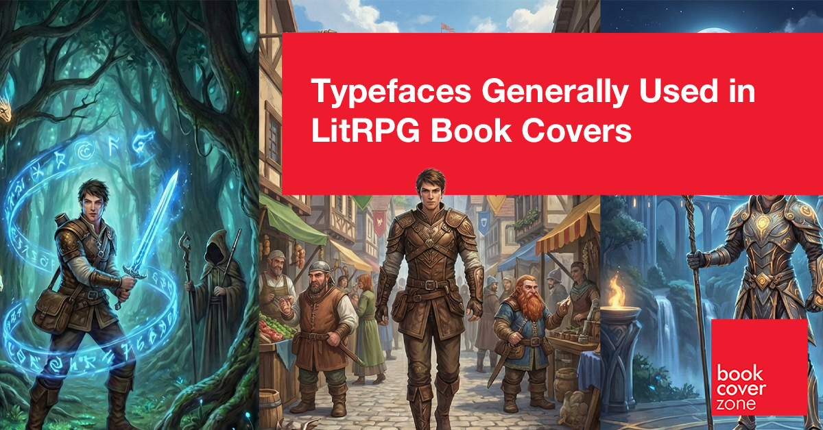
LitRPG is the genre of progression, power-ups, and the digital frontier. Here, typography isn't just a title—it's a User Interface that bridges the gap between the reader and the game world.
When we design a LitRPG cover here at BookCoverZone, we are designing more than just a book; we are designing a HUD (Heads-Up Display). LitRPG (Literary Role-Playing Game) is a genre built on the thrill of mechanics, leveling up, and immersion. In our studio, we treat the typeface as if it were a digital overlay projected directly onto the protagonist's retina. It needs to signal "Game On" immediately, blending the excitement of modern gaming with the narrative structure of a high-fantasy or sci-fi epic.
The Digital Heritage: Pixel and Monospaced Fonts
The soul of LitRPG lies in its gaming roots. To tap into the nostalgia of retro RPGs or the raw data of modern coding, we often turn to Pixelated or Monospaced fonts. Typefaces like Press Start 2P, VT323, or Courier New (with a techno-twist) are essential for stories that lean heavily into the "trapped in a game" trope.
When we use these at BookCoverZone, we aren't just looking for "retro." We use them to suggest a system at work. Monospaced fonts imply a terminal or a log screen—a "Stat Block" coming to life. By applying neon glows or "scanline" effects, we make the title feel like it's flickering on an old arcade monitor or a high-tech visor. It tells the reader that math, stats, and loot are at the heart of the journey.
The Level-Up: Bold and Aggressive Display Fonts
For "Power Fantasy" LitRPG—stories where the hero goes from zero to godhood—we need Bold, High-Energy Display Fonts. We look for typefaces that feel heavy and impactful, such as Impact, Bebas Neue, or Orbitron.
At BookCoverZone, we treat these titles as if they were a "Boss Fight" banner. We often use heavy bevels and chrome textures to make the text look like a 3D asset from a game engine. This creates a sense of "physicality" and momentum. When the font looks like it has been forged from iron or light, it promises the reader a high-stakes, action-packed experience where every character point counts.
Market Snapshot: The "Royal Road" Era and Modern HUDs
The LitRPG market is one of the most dynamic in modern publishing, largely driven by its origins in web serials like Royal Road. Lately, the "clean" trend has taken over. We've moved away from overly cluttered, jagged fonts toward "Sleek HUD" typography. This trend mimics modern AAA game interfaces (think Destiny or Mass Effect)—using clean, wide-tracked sans-serifs like Bank Gothic or Michroma.
At BookCoverZone, we've noticed a significant shift toward "Hybrid Branding." Authors are now using consistent, logo-like typography for their series titles to build a recognizable "Game Brand." We see a blend where the background art remains high-fantasy, but the typography stays strictly high-tech. This "Fantasy-Tech Hybrid" is the hallmark of the current market, signaling a world where magic is governed by code.
The Magic System: Runed and Enchanted Sans Serifs
For LitRPG set in deep fantasy worlds where the "Game System" is magical, we use Geometric Sans Serifs with a "Runic" or "Arcane" modification. Typefaces like Exo 2, Montserrat, or Friz Quadrata provide the perfect balance.
The trick at BookCoverZone is to make the font look "enchanted." We might take a sharp, modern font and manually "cut" runes into the letterforms. By applying an "inner glow" that matches the magic system of the book—be it mana blue, necromancy purple, or health-bar red—we bridge the gap between technology and sorcery. It suggests a "System" that is organic to the world, rather than a computer simulation.
Typeface Hacks For LitRPG Books
LitRPG typography is about the "Gamified" aesthetic. Here are the professional secrets we use at BookCoverZone to make your cover look like a playable experience:
1. The "Progress Bar" Underline: Instead of a standard underline, we create a thin "Experience Bar" or "HP Bar" under the title. Filling it halfway with a bright color suggests a character in the middle of their journey.
2. Chromatic Aberration: We apply a subtle "RGB Split" to the edges of the title. This "glitch" effect makes the font look like a digital projection, perfect for stories involving VR or AI systems.
3. The "Floating" HUD Shadow: Instead of a drop shadow that falls "down," we use a soft glow that sits "behind" the text. This makes the title look like it's floating in mid-air, just like a game menu.
4. Mixing Digital & Medieval: Pair a pixel-style font (for the series name) with a sharp, aggressive serif (for the book title). This contrast perfectly encapsulates the "Knight in a Game" core of the genre.
5. Integrated Damage: We love adding "scratches" or "digital artifacting" to the letters. It makes the title look like it has taken damage in battle, adding a layer of grit and survivalist energy to the design.
LitRPG is an invitation to play, and your cover is the start screen. At BookCoverZone, we specialize in making that first interaction unforgettable. Whether you are browsing our library of high-energy premade designs or looking for a bespoke custom cover that visualizes your unique magic system and stat blocks, our designers are here to help you "Level Up" your book's market presence.